Student Loan Debt

The cost of a higher education has been rising for decades. According to an interesting article on this subject in EconSouth, the Federal Reserve Bank of Atlanta’s quarterly journal, students at four-year colleges and universities paid a national average of between $20,000 and $40,000 last year for tuition, books, and room and board. This range covers a great deal of variation based on geography and type of institution—public or private. It is the average for students living on campus and enrolled in a four-year degree program.

It costs a lot to get a degree these days and this cost is being paid by more people taking on greater and greater levels of debt. Today’s market size is the total debt outstanding, nationally, for student loans. This figure exceeded, for the first time ever in 2010, the national total debt outstanding for revolving credit.

Geographic reference: United States
Year: 2010
Market size: $829.79 billion
Source: “Cap in Hand—The High Price of Higher Education,” EconSouth, first quarter 2011, page 8.
Source: Federal Reserve Bank of Atlanta, College Board, and FinAid.org

e-Filing in the United States

Individual income tax returns were due for 2010 yesterday. A large number of these tax returns are now filed electronically. In 2010 e-filing accounted for 69.3% of all individual income tax forms filed for the tax year 2009. Today’s market size is the number of those returns filed as of December 31, 2010. The IRS expects this figure to rise for coming tax years. Of the returns filed electronically last year, 35.3% were filed by the filer him or herself and the remaining 64.7% were filed by a professional preparer.

Geographic reference: United States
Year: 2010
Market size: 98,740,000 individual tax returns for tax year 2009
Source: “2010 Filing Season Statistics,” an online report made available online by the
IRS here.
Original source: U.S. Internal Revenue Service

U.S. Postal Service

The U.S. Postal Service (USPS) employed 656,000 people in 2010 making it one of the largest single employers in the United States. It handles billions of pieces of mail annually and has been in service since before we were even a nation (1775). In fact, the constitution itself calls for the establishment and maintenance of a postal service. While the rise of electronic means of exchanging data has had an impact on the USPS by reducing the number of items it is charged with carrying annually, the USPS continues to provide an important function in our society. Do not be fooled, no for-profit entity would charge the same amount for daily mail pick-up and delivery to those in distant and hard to reach rural areas as it would charge residents of a densely packed city.

It is true that the USPS is operating at a bit of a loss these days but that could be remedied with a few cent increase in the price of a stamp. While the USPS has been downsizing to adjust to the new realities of the Internet age it is also true that from November 1981 to 2010 the price of a standard stamp increased by less than the cost of inflation. The United States has one of the least expensive postal services anywhere. If you’re interested in how the USPS compares with postal rates in other countries, there is a nice chart on that subject available here.

Geographic reference: United States
Year: 1960 and 2010
Market size: Pieces of Mail Handled: 63.7 and 170.6 billion respectively
Market size: Number of Post Offices: 35,238 and 27,077 respectively
Source: Pieces of Mail Handled, Number of Post Offices, Income, and Expenses, 1789 to 2010, available online here.
Original source: United States Postal Service

Electricity from Renewables

Renewable Energy Sources Worldwide

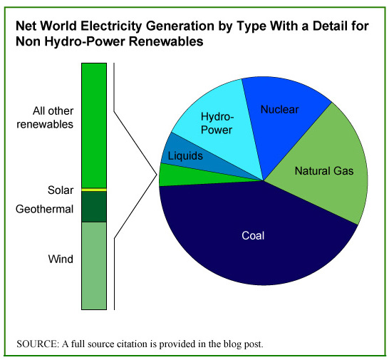
Hydroelectric power plants are the largest producers of electricity from renewable sources. As we saw in yesterday’s Market Size post, they represented 15.97% of world electricity production in 2008. That same year, electricity produced by all other renewable sources accounted for 2.4% of electricity generated. While responsible for only a small percentage of all electricity generation now, renewable sources are forecast to grow steadily through 2035 at which point the nonhydropower portion will account for 7.26% of global production.

The pie chart shows how electricity is generated worldwide and provides a detail of the small pie slice that represents nonhydropower renewables. The renewable energy source that is forecast to grow most quickly in the next decade is solar.

Please note that the Energy Information Administration (EIA) projections exclude electricity generated by so-called off-grid sources, thus renewable energy consumed at the site of production. Energy produced by solar panels installed, for example, on a private home for the sole and exclusive use of the residents of that home is not counted in the EIA projections. If, however, those solar panels are tied into the public electric grid, then the electricity they generate is accounted for in the EIA projections. Time will tell how significant these off-grid electricity generation resources become.

Geographic reference: World
Year: 2007 and 2035
Market size: 463 and 2,554 billion kilowatt hours respectively (please note this is the size of electicity generation from nonhydropower renewable sources)
Source: “Table 12. OECD and Non-OECD Net Renewable Electricity Generation by Energy Source, 2007-2035,” International Energy Outlook 2010, report available online here.
Original source: U.S. Energy Information Administration (EIA)

Hydroelectric Power

The production of electricity with hydroelectric power plants represents 80% of all renewable electric power generation worldwide. Hydro plants work by using the flow of water to turn a turbine, which then turns a metal shaft in an electric generator, which is the motor that produces electricity. Hydroelectric power plants accounted for 15.97% of all electric power produced worldwide in 2008.

In the United States, 6% of electricity is generated in hydro plants, a relatively small percentage compared with other nations. The ability to use hydroelectric power plants to generate electricity is, of course, to a large extent a matter of having the resources needed to harness water’s power. Paraguay, for example, produces 100% of its electricity—as well as electricity enough to export—from hydroelectric power plants while Saudi Arabia has no hydroelectric power generation. A chart which shows the top twenty countries in the world based on their production of hydropower and based on the same source material is presented on the blog, LaMarotte, here.

Geographic reference: World
Year: 2008
Market size: 2,998 Billion Kilowatt hours
Source: “Table 1387. Net Electricity Generation by Type and Country: 2008,” Statistical Abstract of the United States: 2011, page 867, available online here.
Original source: U.S. Energy Information Administration (EIA)

Nuclear Power Plants

Energy Pie Chart

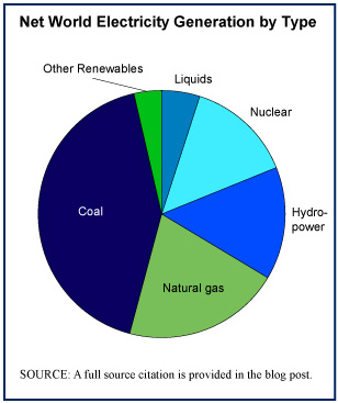
Electricity is generated in a variety of ways which are broken down into the six categories presented in the pie chart to the right. Each method of generating electricity has its pros and cons, its costs, risks, benefits, and advantage, all of which are much debated as we grapple with how best to produce electricity for a world whose demand for it grows annually. And growth in consumption is likely to speed up with the transition from the internal combustion engine to electric-powered vehicles (no pun intended).

Nuclear power plants accounted for 13.8% of global electricity generation in 2008. Nations who use nuclear power generation for the largest percentages of their electricity needs include France (78%), Belgium (55.8%), and Ukraine (47.1%). To see a nice chart of the top twenty leading nuclear power dependent nations, visit the LaMarotte blog, here.

Worth noting is the fact that Japan is among the twenty nations who depend most on nuclear power to generate its electricity. It comes in 10th on that list with 23.7% of its electricity generated at nuclear power plants in 2008.

Geographic reference: World
Year: 2008
Market size: 2,590 billion kilowatt hours
Source: “Table 1387. Net Electricity Generation by Type and Country: 2008,” Statistical Abstract of the United States: 2011, page 867, available online here. The data used to make the pie chart are for 2008 and come from the EIA’s International Energy Outlook 2010, available online here.
Original source: U.S. Energy Information Administration (EIA)

Electric Power Generation

By way of noting this year’s “Earth Hour” (May 26, 2011)—as well as the ongoing challenges being faced by the Japanese as they struggle to get a damaged nuclear power plant stabilized—this week our market size items will all be related to electric energy markets.

We are voracious consumers of electricity, particularly in the industrialized world where even many toothbrushes plug into an electric outlet. Today’s market size is the size of the world’s capacity for generating electricity. Tomorrow we’ll start breaking this down by how the electric power is generated, with coal, hydroelectric dam, nuclear plant, solar panels, etc.

Geographic reference: World
Year: 2008
Market size: 18,778.7 billion kilowatt hours
Source: “Table 1387. Net Electricity Generation by Type and Country: 2008,” Statistical Abstract of the United States: 2011, page 867, available online here.
Original source: U.S. Energy Information Administration

Historically Black Colleges & Universities

Historically Black Colleges and Universities (HBCUs) account for only 20% of African-American college students and yet 40% of engineering degrees earned by African-Americans are earned at HBCUs. “Similarly, of the 21 undergraduate producers of African American science PhDs, 17 were HBCUs.”

Geographic reference: United States
Year: 2010
Market size: 105 HBCUs serving over 300,000 undergraduates and graduate students.
Source: Muhammad, Jesse, “Despite Critics, HBCUs Still Relevant,” The Charlotte Post, February 19, 2011, St. Thomas, Virgin Islands.
Original source: U.S. Commission on Civil Rights report “The Educational Effectiveness of Historically Black Colleges and Universities.” The Department of Education provides a list of HBCUs here.

Gold Bars

A National Geographic journalist, while on assignment for the journal, was given a tour of the vast Paris underground, a maze of structures excavated over the years at various levels under the surface of the Earth. Gold Bars It consists of old crypts, used and unused sewer lines, metro train tunnels, the empty quarries from which much of the stone used to build the city was extracted, and heavily fortified vaults under banks and museums. The journalist and author of the source article, Neil Shae, and his colleague, photographer, Stephen Alvarez, were taken into the vault under the Banque de France and shown the French national gold reserves which are kept there in piles and piles of gold bars, each valued at around $500,000.

Geographic reference: France
Year: 2010
Market size: Approximately 2,600 tons.
Based on the price of gold on the international market on January 28, 2011, the approximate value of the gold bars under the Banque de France is $120.1 billion.
Source: “Under Paris,” National Geographic, February 2011, page 124. The image of gold bars we use here comes from a Banque de France Annual Report, available online here.
Original source: Banque de France

Military Spending

Spending on the military varies greatly from country to country and in part, because of concerns about national security, acquiring information about just what is spent in each country is very difficult. The Stockholm International Peace Research Institute studies this topic and tracks it, publishing an international yearbook with statistics on the same. It has done this since 1969, making the 2010 edition of its yearbook the 41st edition.

The United States ranks at the top of the list of military spending by nation, as it has for decades. In 2009 the United States’ military spending represented 43% of world military spending. The United States’ share of world military spending has consistently been above 40% since the SIPRI Yearbook has been published.

Geographic reference: World
Year: 2009
Market size: $1.531 trillion
Source: “The Top 10 Military Spenders, 2009,” SIPRI Yearbook 2010, Armaments, Disarmament and International Security, page 11, available online here.
Original source: Stockholm International Peace Research Institute

Internet Users Worldwide

The source for this market size is a poster offering a variety of interesting statistics about “our connected world.” Covered on the poster—a link to which is provided below—are statistics on the number of Internet users by country, broadband subscription rates by country, and numbers of people who have mobile only phone access by country. The data are presented graphically and we found it to be an interesting and useful presentation of the material.

Geographic reference: World
Year: 2010
Market size: 1.734 billion users, 20.8% of whom are in China.
Source: “Our Connected World,” made available online by buzzhunt.co.uk here.
Original source: GigaOM, Cisco, and Internet World Stats.

Visitors to Public Gardens

Data show the number of visitors per year to public gardens in the United States. In many places the number of visitors to public gardens has declined in recent years. According to Rick Colbert, director of Tyler Arboretum in Pennsylvania, founded in 1825, “young families are not interested in being outside…. Kids today are much more comfortable behind a computer screen.” As a result, many public gardens are promoting their sustainability efforts, tapping into the theme of “going green”, which is popular with young people.

Geographic reference: United States
Year: 2009
Market size: 70 million
Source: W. Barksdale Maynard, “A Bold New Mission for Arboreta: Sustainability,” American Forests, Autumn 2010, pages 38-43

Truck Border Crossings into the U.S. from Mexico

Four U.S. states share a land border with Mexico over which a great deal of commerce enters the United States by truck. The measurement presented here is the number of truckloads entering the United States from Mexico in 2009. Texas is the state through which the largest number of trucks cross the U.S.–Mexican border.

Geographic reference: United States
Year: 2009
Market size: 4,291,000 crossings
Source: “Table 3-18: Incoming Truck Crossings, U.S. – Mexican Border: 2002–2009,” State Transportation Statistics 2009, page C-14.
Original source: Research and Innovation Technology Administration, Bureau of Transportation Statistics, U.S. Department of Transportation

Truck Border Crossings into the U.S. from Canada

Ten U.S. states share a land border with Canada over which a great deal of commerce enters the United States by truck. The measurement presented here is the number of truckloads entering the United States from Canada in 2009. Michigan is the state through which the largest number of trucks cross the border.

Geographic reference: United States
Year: 2009
Market size: 5,021,000 crossings
Source: “Table 3-12: Incoming Truck Crossings, U.S. – Canadian Border: 2002–2009,” State Transportation Statistics 2009, page C-12.
Original source: Research and Innovation Technology Administration, Bureau of Transportation Statistics, U.S. Department of Transportation

Bridges

The total number of road bridges presented in this market size post can be broken down by whether these are rural bridges or urban area bridges. Rural bridges make up 74% of the total and urban bridges 26%. According to the source, nearly a quarter of these bridges are in poor shape, defined as either structurally deficient or, more ominously, functionally obsolete.

Geographic reference: United States
Year: 2009
Market size: 601,078 bridges
Source: “Table 1-5: Number of Road Bridges by Functional System: 2009,” State Transportation Statistics 2009, page A-5.
Original source: Research and Innovation Technology Administration, Bureau of Transportation Statistics, U.S. Department of Transportation

Miles of Toll Roads

The vast majority of roads in the United States are freeways, in the true sense of the word, no direct fee for use is charged for traveling those roads. Only a very small number of toll roads exist in the United States, as of 2008. That number will likely grow if the trend towards the privatizing of previously public activities continues.

Geographic reference: United States
Year: 2008
Market size: 4,919.6 miles
Source: “Table 1-3: Toll Roads, Toll Bridges and Tunnels, and Toll Ferry Routes: 2008,” State Transportation Statistics 2009, page A-3.
Original source: Research and Innovation Technology Administration, Bureau of Transportation Statistics, U.S. Department of Transportation

Paved Roads

Roads by Type

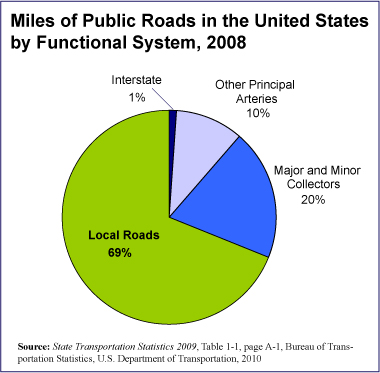
As a nation of heavy drivers, it is not surprising that we have an awful lot of paved roads. The market size presented here is for miles of paved, public roads in the United States. The chart shows how those roads are broken down by type: interstate freeways, other highways (arteries), smaller roads feeding the highway system (collector roads), and local roads.

Geographic reference: United States
Year: 2008
Market size: 4,042,778 miles
Source: “Table 1-1: Public Road Length, Miles by Functional Systems: 2008,” State Transportation Statistics 2009, page A-1.
Original source: Research and Innovation Technology Administration, Bureau of Transportation Statistics, U.S. Department of Transportation