Spending on Internet Access

Today’s market size is the amount that was spent in the United States on Internet access in 2005 and in 2012. The increased spending from 2005 to 2012, after inflation, was 154% while the increased penetration of Internet access as a percent of the U.S. population grew by only 19% (from approximately 68% to 81%). Clearly, something other than a rising rate of Internet connectivity in the population is behind the rapidly rising national expenditure on Internet connectivity. The increased expenditure is most likely related to the changing infrastructure used to access the Internet. Users are shifting from dial-up connections to more costly, higher speed connections such as DSL (Digital Subscriber Line), Cable Internet access, Satellite Internet access and mobile broadband via cell phone service.

Geographic reference: United States
Year: 2005 and 2012
Market size: $29.7 billion and $80.7 billion respectively
Sources: (1) “Table 2.4.5 Personal Consumption Expenditures by Type of Product,” National Income and Product Accounts Tables, (NIPA), U.S. Bureau of Economic Analysis, August 7, 2013, available from the BEA web site here. (2) “Percent of Individuals Using the Internet 2000–2012,” ITU, available here.
Original source: U.S. Department of Commerce, Bureau of Economic Analysis, International Telecommunications Union (ITU), Federal Communications Commission (FCC)
Posted on January 14, 2014

Farms

Farms

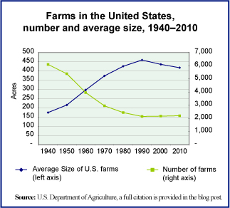
It takes far fewer acres to produce the food we need and in the United States the total number of acres used in agriculture have been shrinking for decades, while output has grown. The number of farms has also been shrinking as larger and more industrial-sized farms have come to dominate the market.

These trends in farming can be seen in the graph. It shows the number of farms and the average size of U.S. farms each decade since 1940. What we thought was of interest is the fact that there has been a small change in the century-long trend of growing average farm size. Since 1990, the average size of farms has actually shrunk, slightly, from 460 acres to 418 acres. There was also a slight increase in the number of farms between 2000 and 2010. The relatively small movement back to family or small-scale farming, and in particular organic farming, is large enough to be visible in the national statistics and on the size of the average farm in the United States.

Today’s market size is the total number of farms in the United States in 1990 and 2010 as well as the total value of farm output in those two years.

Geographic reference: United States
Year: 1990 and 2010
Market size: 1990: 2,146 farms with output valued at $180 billion
Market size: 2010: 2,201 farms with output valued at $300 billion
Sources: (1) “Table 824. Farms—Number and Acreage: 1990 to 2010,” Statistical Abstract of the United States: 2012, U.S. Census Bureau, December 2011, page 536, available online here. (2) “Table 1101. Farms—Number and Acreage: 1959 to 1989,” Statistical Abstract of the United States: 1990, U.S. Census Bureau, January 1990, page 638. (3) “Series K 1-16. Farm Populations, Land in Farms, and Value of Farm Property and Real Estate: 1850 to 1970,” Statistical Abstract of the United States: Colonial Times to 1970, U.S. Census Bureau, September 1975, page 457.
Original source: U.S. Department of Commerce, Bureau of the Census
Posted on January 10, 2014

Charter Schools

The National Education Association defines charter schools as follows: “Charter schools are publicly funded elementary or secondary schools that have been freed from some of the rules, regulations, and statutes that apply to other public schools, in exchange for some type of accountability for producing certain results, which are set forth in each charter school’s charter.” The first charter school was established in Minnesota in 1991 as a part of ongoing educational reform efforts and more specifically, an expansion of market-based school reform. Proponents of charter schools claim that they bring much needed entrepreneurial spirit and a competitive ethos to public education. Opponents claim that to outsource the running of public schools to private entities is to redirect already scarce resources to service fees and profits while creating new layers of administration.

Since the first charter school was established in Minnesota, 40 additional states have passed legislation permitting the formation of charter schools and the number of such schools has grown with each passing year. The formation of Education Management Organizations (EMOs), both nonprofit and for-profit, has been one result of the legislation enabling charter schools. Some EMOs are now quite large, managing dozens of schools while others manage a single school. The diversity of this category of management companies is quite extreme. While not all charter schools are operated by EMOs, in the academic year 2011-12 such EMOs accounted for approximately 39% of all charter schools and 50% of all students enrolled in charter schools. And of the nearly one million students enrolled in EMO-run schools that year, 51% were enrolled in for-profit EMOs.

Today’s market size is the total number of charter schools operating in the United States in the academic years beginning in 2000 and 2010. While charter schools still make up a very small percentage of all public schools in the country (5.3%), it is an area that some people feel holds great promise for further privatization of government services.

Geographic reference: United States
Year: School year starting in the fall of 2000 and 2010
Market size: 1,993 and 5,274 respectively
Sources: (1) “Charter Schools,” a fact sheet on the National Education Association web site from which we quote the definition of these schools, available online here. (2) Gary Miron and Charisse Gulosino, Profiles of For-Profit and Nonprofit Education Management Organizations, November 2013, National Education Policy Center, available online here. (3) Tables 71, 98, and 161 from chapter two of the Digest of Education Statistics: 2012, published by the NCES in 2013 and available online here.
Original source: U.S. Department of Education, National Center for Education Statistics (NCES); National Education Policy Center, Commercialism in Education Research Unit (CERU)
Posted on January 8, 2014

Independent Bookstores

Bookstores
A recent article titled “Independent bookstores turn a new page on brick-and-mortar retailing,” by Michael Rosenwald and published on the Washington Post website, here, grabbed our attention. It appears that after years of shrinking, independent bookstores may have hit bottom. In fact, there are some signs of growth as new independent store openings may be outpacing closures.

As we learned some years ago when we did a study of the publishing industry, getting reliable statistics on the national book retailing industry is not easy. This is in part because it is always difficult to track an industry that is going through significant change and reorganization. The selling of books definitely falls into that category. Over the last two decades it has been a standout in this regard within an entire sector—the retail sector—going through significant change. From the rise and fall of the big bookstore chains such as Borders and Barnes & Noble to e-books, Amazon and the spread of books into a growing number of big box, discount outlets, independent booksellers have seen their share of the business shrink for decades.

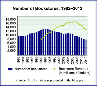
The graph we offer shows the total number of bookstores in the United States, annually, over a three-decade period. It also shows industry revenues for the last twenty years of that period. The data charted all come from the U.S. Census Bureau’s reports on the industry and their County Business Patterns database. While total bookstore numbers are available, it is more difficult to tease out of these data the store count by independent bookstores versus the larger stores run by big chains that began to dominate the industry in the 1990s. The graphic fails entirely to capture the rise of e-books and e-commerce. Nonetheless, it provides an overview of the pattern made by the ups and downs of the brick-and-mortar bookstore.

From these overall figures, we can make educated estimates about a few things. By taking data from the Annual Reports of three of the largest bookselling chains, Borders (until 2011), Barnes & Noble, and Books-A-Million, we have calculated the following rough outline of independents versus chains in 2002 and a decade later, in 2012. In 2002, the three largest chains accounted for 21% of all bookstores and 49% of bookstore sales. In 2012, after the bankruptcy of Borders, the remaining two large chains accounted for approximately 20% of the stores and 57% of all the sales made by bookstores.

Today’s market size is the approximate number of independent bookstores and small chain bookstores in the United States in 2012 as well as the value of their sales in that year.

Geographic reference: United States
Year: 2012
Market size: 6,043 bookstores with revenues of approximately $5.76 billion (based on Census data on bookstore sales, less sales by the two largest chains, Barnes & Noble and Books-A-Million)
Sources: (1) Gabe Habash, “Bookstores in America, 2013: A State-by-State Guide, Publishers Weekly, June 1, 2013, available online here. (2) Latest Annual Retail Trade Reports, part of the Census Bureau’s monthly and annual compilation of data on the retail sector, taken from the website here and more specifically, the report titled Annual Retail Trade Survey—2011: Sales (1992-2011) using monthly reports to update the annual figure for 2012.
Original source: U.S. Department of Commerce, Bureau of the Census, the American Booksellers Association, and Publishers Weekly
Posted on December 30, 2013

Used Cars in China

The auto market in China, like most markets, is growing rapidly. Demand for cars has been growing annually as the purchasing power of millions of Chinese people increases as that country becomes an economic powerhouse. But because the mass market for automobiles in China is relatively new—having taken off in earnest starting four or five years ago, according to the first source listed below—a used car market is an even newer thing in China. It takes, on average, four years for a new car to be traded in for an “upgrade” and thus become available for resale as a used car.

Today’s market size is the estimated number of used cars sold in China in 2012 as well as a forecast for the number of used cars that will be sold in 2016 and 2020. For comparison purposes, let us point out that in the United States in 2012, used car sales were nearly three times greater than new car sales whereas in China, used car sales were only one-third the number of new car sales. The used car market in China is very young, with lots of room to grow.

Geographic reference: China
Year: 2012 and forecasts for 2016 and 2020
Market size: 4.8, 10.0 and 20.0 million respectively
Sources: (1) Kelvin Chan, “Auto Sales Boom Spawns a Growing Used Car Market in China,” Detroit Free Press, November 27, 2013, available online here. (2) Cliff Atiyeh, Used-car Sales Climb as Americans Hold Onto Older Vehicles,” MSN.com, February 4, 2013, available online here.
Original source: Changan Ford, the U.S. company’s China joint venture
Posted on December 11, 2013

Apprenticeships

YouthUnEm

Apprenticeship programs have been around for centuries. In the most basic sense, an apprentice is somebody learning the skills of a particular trade by working with a skilled worker. In industrialized countries, apprenticeship programs vary greatly from a regulated arrangement between private companies and schools and/or trade unions to less formal arrangements in which a person new to a field of endeavor works alongside somebody already skilled in that field. Most apprenticeship programs include classroom work as well as on-the-job training.

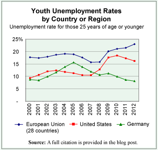
There are many things that play a role in the fluctuations of unemployment rates and these rates tend to be higher for younger people than for those more established in their work lives. Thus, having a youth population that is well trained for the jobs that are available seems a natural aid to keeping the youth unemployment rate down. From the data available on countries of the European Union—where the prevalence of apprenticeship programs is greater than in the United States, although it does vary from country to country—there seems to be a discernible connection between lower youth unemployment rates and the prevalence of robust apprenticeship programs. By way of comparison, we offer the graph that shows the youth unemployment rate for the first decade of the current century for the European Union, for Germany, and for the United States.

While the youth unemployment rate in the European Union as a whole, in 2012, was 23% it ranged widely from a low of 8.1% in Germany to a high of 55.3% in Greece. Interestingly, the two European countries with the lowest youth unemployment rate are also two of the countries in the Union with the most robust apprenticeship programs, Germany and Austria.

In the United States, apprenticeship programs are not as heavily used as they are in Europe. Trade unions used to be primarily a source of such programs in the United States but with the decline in union membership over the last decades these programs have also been in decline. That is until recently. European companies are starting to establish apprenticeship programs in the United States to train the workforce they need for their U.S. facilities.

Today’s market size is the number of people in the United States participating in apprenticeship programs that are registered with the U.S. Department of Labor. The approximate number participating in such programs in Germany is also provided.

Geographic reference: United States and Germany
Year: 2012
Market size: United States: 358,000 (with an additional, approximately 450,000 involved in programs not registered with the Department of Labor)
Market size: Germany: 1.6 million
Sources: (1) “Registered Apprenticeship National Results,” U.S. Department of Labor, Employment and Training Administration, June 7, 2013, available online here. (2) Unemployment Rate by Age Group,” Eurostat, October 31, 2013, available online here. (3) “Apprenticeships: Earn while you learn,” Bureau of Labor Statistics, Summer 2013, available online here.
Original source: U.S. Department of Labor and Eurostat
Posted on December 2, 2013

Cranberries

Cranberries, a native fruit of North America, are consumed most frequently in the form of juice. However, during the celebration of Thanksgiving in the United States, cranberries in a more solid form have an important place on the menu. Wisconsin is the cranberry-producing center of the United States. It’s crop, in 2012, accounted for more than half of all fresh cranberries sold in the country.

Today’s market size in the estimated value of the 2012 cranberry harvest in the United States.

We wish you much to be thankful for on this day before Thanksgiving, 2013.

Geographic reference: United States
Year: 2012
Market size: $386 million (slightly more than 8 million barrels of cranberries)
Source: Malinda Geisler and Diane Huntrods, “Cranberries Profile,” Agricultural Marketing Resource Center (AgMRC), Iowa State University, available online here.
Original source: U.S. Department of Agriculture
Posted on November 27, 2013

Roundabouts

Roundabout

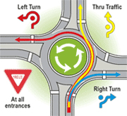
Roundabouts are a road design used to replace a traditional four or six-way intersection, referred to as a crossroads intersection, with a circular path around which traffic flows, continuously, in one direction. The graphic provides an overview of such a roundabout.

For a driver not accustomed to this sort of intersection, a roundabout may be disconcerting at first. However, study after study shows that in the right locations roundabouts are an improvement over more traditional crossroad intersections in two ways: by increasing the flow of traffic and by reducing (by 76%) the number of injury-producing accidents. The reduction in accidents leading to fatalities in a roundabout versus a crossroad intersection is even greater since speeds are reduced throughout the intersection. According to the U.S. Department of Transportation, there are 90% fewer fatal accidents in crossroads intersections that have been replaced by roundabouts.

Today’s market size is the estimated number of roundabout intersections worldwide, in 1997 and in 2012.

Geographic reference: World
Year: 1997 and 2012
Market size: 35,000 and 60,000 respectively
Source: “The Widening Gyre,” The Economist, October 5, 2013, page 16. The graphic comes from a Michigan Department of Transportation website, here.
Original source: U.S. Department of Transportation
Posted on November 25, 2013

Methamphetamine Laboratory Cleanup

MethLabs

The societal costs of the methamphetamine—crystal meth or simply meth for short—drug business, if we can call the trade in this illegal drug a business, is very difficult to calculate. It negatively impacts the health and welfare of the participants and the communities in which it is most active. These tend to be rural communities located in the mid-section of the country. The states fighting the largest battles with the meth trade are Missouri, Tennessee, Indiana and Kentucky.

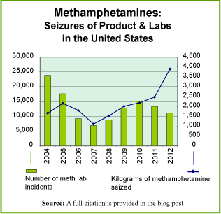
The graph shows the number of methamphetamine laboratory incidents reported by the Drug Enforcement Administration (DEA) over the period 2004–2012. An incident is any seizure of a meth lab, a dump site or stashes of chemical and glassware. The graph also shows the quantity of methamphetamine seized by the DEA over this period.

There is one cost associated with the meth trade, of so many costs to society, that has been a stimulus to a legal business activity. That is the cost of cleaning up clandestine laboratories in which this drug is produced, or cooked in the vernacular of this trade. The methods used to make this drug also produce a lot of hazardous fumes and byproducts. Therefore, meth labs must be handled carefully and then thoroughly cleaned up after a seizure. The cost of such cleanups depends greatly on the size of the facility but it can run anywhere from $1,000 per site to $25,000 per site or even more in some extreme cases. Specially certified waste management firms and environmental consulting firms are contracted to carry out this cleanup work.

Today’s market size is the estimated amount spent in the United States cleaning up meth labs in 2012. Worth noting is the fact that this money was concentrated in the ten states in which most meth trade occurs. Together these ten states represent 82.4% of all meth lab incidents. For more details on which states have the highest level of meth activity, go to the DOJ website listed as the third source below.

Geographic reference: United States
Year: 2012
Market size: $29 million
Sources: (1) Jonah Engle, “Merchants of Meth,” Mother Jones, July/August 2013, page 33. (2) “DEA Domestic Drug Seizures,” part of a U.S. Department of Justice web site available online here. (3) “Methamphetamine Lab Incidents, 2004–2012,” another DOJ offering on its website here.
Original source: U.S. Department of Justice
Posted on November 22, 2013

Catastrophe Bonds

Catastrophe bonds, or cat bonds, are bonds sold by an entity wishing to reduce its liability in the face of catastrophic losses such as the ones being caused by the seemingly increasingly violent natural storms occurring around the world. The market for cat bonds has been strong and growing as both the need for risk mitigation has risen as have the number of large investors searching for lucrative investment opportunities in an era of low interest rates.

An example of a cat bond is one issued by New York City’s transit authority in the aftermath of Superstorm Sandy. When insurance carriers, reeling from the costs associated with that storm, hesitated to underwrite the risk of future water surges, the transit authority issued a catastrophe bond in the amount of $200 million. The money will be used to repair damage to the subway system in the event of another flooding storm that reaches the same levels as Sandy within the next three years. If there is no serious storm within that period of time, the money will be returned to investors with an interest payment that—in 2012 for cat bonds—was running at 11% over the rate for Treasury Bills.

Today’s market size is the total value of catastrophe bonds outstanding as of October 1, 2013, worldwide.

Geographic reference: World
Year: 2013
Market size: $19 billion (up from $4 billion a decade ago)
Source: “Perilous Paper,” The Economist, October 5, 2013, pages 76-77.
Original source: Swiss Re Capital Markets
Posted on November 20, 2013

Telephone Service: Landline versus Wireless

PhoneServiceMI

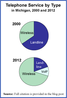
The past decade has been one of great changes in the telephone service landscape. As investment has been made in the wireless infrastructure, cell phone coverage has become much more reliable. With growing reliability of cell phones has come the option for many to do away with one’s landline phone service. The pie chart on the right shows this clearly. In the State of Michigan, the decline of landline accounts and the rise of wireless accounts has been significant since the turn of the century. For the year 2012, the graph includes a count of the users of a system called VoIP, which stands for Voice over Internet Protocol and is a telephone-like service offered to those with access to high-speed Internet connections.

There is now legislation pending in the State of Michigan to allow landline telephone service providers to begin discontinuing service to customers, after a 90-day notice, starting in 2017. This legislation would, in essence, do away with the legal right to have access to landline phone service at almost any address in the United States, a right that dates back to the early 1910s and was updated most recently in the FCC Telecommunications Act of 1996.

Michigan would not be the first state to pass such legislation. Similar laws have already passed in other states like Texas, Florida, and North Carolina. As the landscape for telephone service changes, one can not help but worry about those in areas not well covered by alternate phone service options. While wireless coverage has improved significantly over the years it is not yet near universally accessible and many people still depend upon landline service for dependable telephone connectivity.

Today’s market size is the number of phone service accounts, regardless of type—landline, wireless cell service, and/or VoIP—in the State of Michigan in 2000 and 2012. Worth noting is the population of the State in Michigan in those two years; 9.94 million and 9.88 million respectively (yes, Michigan did actually lose population over this period). Thus, the number of telephone service accounts per capita has risen over this period from 1.03 to 1.35.

Geographic reference: Michigan
Year: 2000 and 2012
Market size: 10.2 million (66% of which were landline accounts) and 13.3 million (20% landline accounts) respectively
Sources: (1) Kathleen Gray, “Still Have a Landline? Proposed Michigan Legislation Could Spell The End by 2017,” Detroit Free Press, November 18, 2013, available online here. (2) David Cay Johnson, “Phone Service for All, No Matter What Kind,” Reuters, March 28, 2012, available online here. (3) “State & County QuickFacts—Michigan,” an extract of Census Bureau data on population statistics made available on the Census web site here.
Original source: U.S. Federal Communications Commission and the U.S. Census Bureau
Posted on November 18, 2013

Automotive Semiconductors

Semiconductors—the essential foundation upon which modern electronics rest—are found in all electronic devices as well as many products that one would not initially think of as electronic, such as greeting cards with embedded audio chips in them to produce music upon opening. The use of semiconductors in the automotive industry has made the modern car/truck one of the most advanced electronic devices most people own, often without even knowing it.

Semiconductors are, in the simplest terms, elements like germanium and silicon that conduct electricity at only moderate rates, thus they are “semi” conductors. These elements are used to make the semiconductor chips that are embedded in electronic devices to allow the use of electrical currents as a signal. All cybernetics rely on this type of signaling.

Today’s market size is the estimated value of the automotive semiconductor market, worldwide, in 2012 (when it represented 8.1% of the total world semiconductor market) and a projection of the market’s value in 2020.

Geographic reference: World
Year: 2012 and a projection for 2020
Market size: $23.4 billion and $33.5 billion respectively
Sources: (1) Gary S. Vasilash, “The Supercomputer in Your Garage,” Car and Driver, December 2013, page 34. (2) Monique D. Magee, editor, “Semiconductors,” Market Share Reporter: Trends Over Time, GALE Cengage Learning, 2012, page 553.
Original source: Strategy Analytics
Posted on November 15, 2013

Home Health Care Services

With an aging population it will come as no surprise to most people that the home health care services industry has seen steady growth over the last decades and is forecast to see continued growth well into the next decade.

Today’s market size post is the revenue earned in 2002 and 2012 by all firms with employees in the business of providing home health care services in the United States. This industry [NAICS 6216] is defined as follows by the Census Bureau: “This industry comprises establishments primarily engaged in providing skilled nursing services in the home, along with a range of the following: personal care services; homemaker and companion services; physical therapy; medical social services; medications; medical equipment and supplies; counseling; 24-hour home care; occupation and vocational therapy; dietary and nutritional services; speech therapy; audiology; and high-tech care, such as intravenous therapy.”

Geographic reference: United States
Year: 2002 and 2012
Market size: $30.39 billion and $66.07 billion respectively
Sources: (1) “Table 8.1. Health Care and Social Assistance (NAICS 62)—Estimated Revenue for Employer Firms: 2002 Through 2010,” Service Annual Survey 2010, February 2012, page 151, available online here. (2) “Table 1 – Selected Services Estimated Quarterly Revenue for Employer Firms Fourth Quarter 2003 Through Fourth Quarter 2012,” Annual Benchmark Report for Services through 2012, a link to which is available on the U.S. Census Bureau’s website, here.
Original source: U.S. Department of Commerce, Bureau of the Census
Posted on November 13, 2013

U.S. Veteran Population

Veterans2

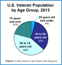
Today we present a brief market size post on the U.S. veteran population, in honor of those veterans on this Veteran’s Day. The pie chart shows the population broken down into four age groups. While the total number of veterans has been declining for many decades now, the number of veterans living with service-connected disabilities has been rising. Between 1990 and 2012, the number of veterans with service-connected disabilities grew by 46%.

Geographic reference: United States
Year: 2013 and a projection for 2020
Market size: 21,972,964 and 19,604,276 respectively
Sources: (1) “Table 1L: VETPOP2011 Living Veterans by Age Group, 2010-2040,” a statistical table made available by the U.S. Department of Veterans Affairs on their website here, towards the bottom of the page on the right side. (2) “Trends in the Utilization of VA Programs and Services,” prepared by the National Center for Veterans Analysis and Statistics, January 2012, available online here.
Original source: U.S. Department of Veterans Affairs
Posted on November 11, 2013

Bikes in Europe

EuroBikes

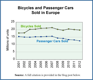
Bicycles outnumber automobiles in the world and always have. While bike commuting dominates in most of the developing world, it lags far behind in the industrialized centers of the world. But, this is changing, slowly. The industrial world is experiencing a rise in bicycle ridership—in Europe motivated in part by the severity of the recession and financial crisis that started in 2008—and spending on infrastructure supportive of bike commuting is on the rise.

The graph shows the number of bicycles and number of passenger cars sold annually in the 27 countries of the European Community between 2001 and 2012. While the sale of cars has fallen, the sale of bikes has been reasonably steady—despite a very serious recession—and ended the period higher than it began, with sales of 19.7 million units in 2012 versus 18.9 million in 2001.

Geographic reference: European Community
Year: 2012
Market size: 19.72 million bicycles (850,000 of these bikes were electric-assist bicycles, the segment of the market growing most quickly)
Sources: (1) European Bicycle Market, 2013 edition, Industry & Market Profile, October 2013, Association of the European Two-Wheeler Parts’ & Accessories’ Industry, page 18, available online here. (2) Martin Campestrini and Peter Mock, European Vehicle Market Statistics, Pocketbooks, 2011 Edition, ICCT, pages 39-48.
Original source: COLIBI, the Association of the European Bicycle Industry, COLIPED, the Association of the European Two-Wheeler Parts’ & Accessories’ Industry and the International Council on Clean Transportation (ICCT)
Posted on November 6, 2013

Pharmacy Benefit Managers

The cost of prescription drugs in the United States is a subject about which there is much controversy. As the Affordable Care Act—or, Obamacare—gets off to a rocky start across the nation, we decided to look at just one small part of the prescription drug distribution network, about which most people are not particularly conscious. That is the segment made up of Pharmacy Benefit Managers (PBMs), middlemen who stand in a central position in the prescription drug supply chain and who, it turns out, have carved out for themselves a rather lucrative business. The three largest PBMs—Express Scripts, CVS Caremark, and OptumRx—together control about 70% of all prescriptions filled in the United States.

PBMs are firms that provide an administrative service to insurance companies, large self-insured employers, and government benefit providers. They develop and maintain drug formularies—lists of specific drugs to be covered and the prices for each—for their insurance providing customers. They also negotiate with pharmaceutical companies for preferred pricing on the drugs covered in those formularies and they negotiate with retailers to accept those terms and participate in the PBM’s network of preferred pharmacies.

According to an article in Fortune magazine, “PBMs started as paper pushers: They began hand-processing medical claims in the 1970s and evolved into middlemen who touted their ability to use corporate customers’ combined purchasing power to negotiate huge discounts from pharmaceutical companies. Today the top PBMs are as big as or bigger than their clients.” The United States has a unique health care delivery system, one which is significantly fuller of lucrative middleman-businesses than the systems present in other industrialized nations.

Today’s market size is the total estimated revenue earned by Pharmacy Benefit Managers in the United States in 2012.

Geographic reference: United States
Year: 2012
Market size: $250 billion
Source: Katherine Eban, “Painful Prescription,” Fortune, October 28, 2013, pages 202-207.
Original source: J.P. Morgan analysts
Posted on November 4, 2013

Haunted Houses

Pumpkins-2013-4

Halloween is no longer a one day affair and haunted houses aren’t just for kids anymore. Many haunted houses are Hollywood-style productions with animatronics, realistic special effects, and actors in professional makeup. Haunted houses of the past were often run by neighborhood organizations as a way to do a bit of fundraising. Today, many are straightforward profit making operations.

Some operators of haunted houses combine them with rock concerts, mud runs, and paintball battles. Others combine multiple sets with corn mazes and hayrides. The haunted house experience has become an evening’s entertainment for many. More than 31 million people are expected to visit haunted houses in 2013. Worldwide there are around 2,500 haunted house attractions, the vast majority in the United States.

Today’s market size is the estimated total sales generated by haunted houses in 2013 (dare we say, by the haunted house industry?). Now that is scary….

Happy Halloween

Geographic reference: World
Year: 2013
Market size: $300 million… still a fraction of the estimated $7 billion that will be spent on Halloween related items and activities in the United States this year!
Source: Martha C. White, “It’s Aliiiive! Haunted-House Industry Scares Up Big Money,” NBC News, October 6, 2013, available online here.
Original source: National Retail Federation
Posted on October 31, 2013

Orange Juice

Faced with a greater variety of beverage choices, including exotic juices and energy drinks, and higher prices for orange juice due to the spread of citrus greening disease, consumers are increasingly choosing those alternatives over the breakfast staple, orange juice. Total U.S. retail unit sales in the 2012-2013 season reached its lowest level since the 1998-1999 season.

Data show the total U.S. retail sales of orange juice by volume in the 2012-2013 season.

Geographic reference: United States
Year: 2012-2013
Market size: 563.2 million gallons
Source: Alexandra Wexler, “The Slow Death of a Former Breakfast Table Star,” The Wall Street Journal, October 14, 2013, available online here.
Original source: Nielsen
Posted on October 29, 2013

Dentistry

Dentists

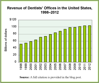
The practice of dentistry is a part of the overall health care industry and recent trends in this segment of the health care industry show a pattern similar to that of the industry as a whole. Steady growth. The graph shows estimated revenue taken in by Offices of Dentists annually from 1998 through 2012. While the rate of increase slowed a bit after the recession and financial crisis that hit in 2007 and 2008, growth in revenue continued. The growth in revenue for dentist offices between 1998 and 2012 exceeded inflation by 61.6% (dentistry’s 102.6% increase versus inflation which grew 41%).

Factors influencing that rate of growth for dentists are many of the same factors driving the overall health care industry, primarily among them, demographics and technology. As we age, we need more health care services of all sorts, including dental care. Technological advances are a driver in the field because they make available services that simply did not exist before and improve the ones that did. According to the American Dental Trade Association in the early 2000s nearly half of dentists’ revenues were being generated from procedures and treatments that were not available 20 years earlier.

Today’s market size is the total estimated revenue earned by offices of dentists in the United States in 2000 and in 2012.

Geographic reference: United States
Year: 2000 and 2012
Market size: $58.8 billion and $104.3 billion respectively
Sources: “Table 8.1. Health Care and Social Assistance (NAICS 62)–Estimated Revenue for Employer Firms: 2002 Through 2010,” Service Annual Survey 2010, U.S. Census Bureau, February 2012, page 171, a link to which is offered here. Data for years before 2002 come from the Service Annual Survey 2003, available from the same website. The data from 2011 and 2012 come from the “Estimated Quarterly Revenue for Employer Firms, Fourth Quarter 2003 Through Fourth Quarter 2012,” part of the same Annual and Quarterly Services tracking done by the Census Bureau in preparing their annual report. The quarterly data are available here. Jeffrey R. Lavers, “Market Trends in Dentistry,” Dental Economics, available online here.
Original source: U.S. Department of Commerce, Bureau of the Census
Posted on October 24, 2013

Public Pensions

Large pension plans have been struggling, in a period of very low interest rates since the financial crisis of 2008, to balance their asset allocation in such a way as to maximize returns. Assumptions have been made for many years now about what the average return on investment should be for public pension funds. The money going into these pension funds has been calculated accordingly. But, it turns out that the assumed annual rates of return (between 7% and 8%) have been quite optimistic. If the funds do not generate the anticipated annual returns, then more must be put into them if they are to meet their obligations to retirees. Over the ten year period 2002–2012, the public pension plans run by U.S. states have had an average annual rate of return of 6.4%.

Today’s market size is the value of all public pension assets in the United States in 2012.

Geographic reference: United States
Year: 2012
Market size: $2.6 trillion, approximately 16% of the total of all assets allocated for pensions, public and private, not including Social Security System funds
Sources: (1) Gretchen Morgenson, “How You Can Pay Millions and Lag Behind the Market,” The New York Times, October 20, 2013, B1. (2) Cliffwater 2013 Report on State Pension Performance and Trends, July 22, 2013, available here.
Original source: Cliffwater and data filed by each state in what is known as the Comprehensive Annual Financial Report (CAFR)
Posted on October 21, 2013