Moving Day

Bar Chart

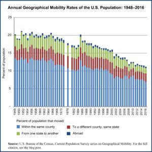
Today we are looking at the number of people who make a residential move in the United States each year. This is a measure of geographical mobility and has been tracked by the U.S. Census Bureau annually for decades. Using their data we produced a graph showing the annual percent of the U.S. population aged one year or more that moved from one place to another each year.

Americans think of themselves as a very mobile people, both in terms of economic mobility as well as actual, physical mobility. And yet, in truth, we are less mobile than we were in the past. As the data in the graph show, we actually move far less often now than in the past. The trend is towards fewer moves and moves of shorter distance.

There are many reasons for this change, from an aging population to less regional diversity in the growing service industries than existed in the manufacturing sector. An increasing use of occupational licensing practices and a declining rate of job changing in the United States also contribute to this change. (Yes, contrary to popular thought, we actually change jobs more infrequently than in the past.)

Some analysts see the declining rate of geographical mobility in the United States as one of the reasons behind a declining rate of productivity growth. Others see it as just another consequence of decreased median income growth. What is clear is the fact that we are staying put at much higher rates now than we did thirty years ago.

For those interested in reading more about this topic, we provide a link to further reading about it under the source note below.

Geographic reference: United States
Year: 1976 and 2016
Market size: 36.8 million (17.7% of the population) and 35.1 million (11.2%)
Source: “Table A-1. Annual Geographical Mobility Rates, By Type of Movement: 1948-2016,” Current Population Survey, Historical Migration/Geographic Mobility Tables, November 15, 2016, available here.
Original source: U.S. Department of Commerce.
Further reading: Tyler Cowen, “The Unseen Threat to America: We Don’t Leave Our Hometowns,” Time, February 22, 2017, available online here.

U.S. Population Over 165 Years

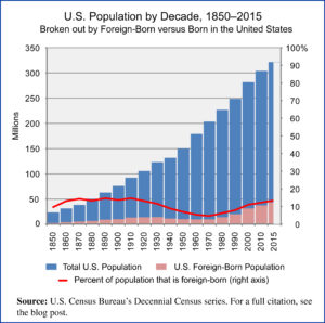
US Population 1850-2015

Since the beginning of the 21st century the movement of people around the globe has picked up. Factors such as globalization, wars and natural disasters have spurred an increase in the number of people emigrating or finding themselves forced into fleeing their homes and becoming refugees, looking for a new home. Resistance to newcomers is on the rise in many places and tensions run high when the topic of immigration comes up in public discourse. This set of circumstances made us wonder about the actual numbers of foreign-born people residing in the United States.

Today’s market size is the number of foreign-born people living in the United States in 2000 and in 2015. In the year 2000 foreign-born residents made up 12.4 percent of the U.S. population and in 2015 they accounted for 13.5 percent of all residents. The graph shows how the number of foreign-born persons in the population has trended over the last 165 years.

Geographic reference: United States
Year: 2000 and 2015
Market size: 31.1 and 43.3 million respectively
Source: Campbell Gibson and Kay Jung, “Table 1. Nativity of the Population and Place of Birth of the Native Population: 1850 to 2000,” Historical Census Statistics on the Foreign-Born Population of the United States: 1985 to 2000, U.S. Census Bureau, February 2006, available here; “Table 1.1 – Population by Sex, Age, Nativity, and U.S. Citizenship Status, 2010,” from the Census Bureau’s Current Population Survey, March 2010 Detailed Tables, available here, and “Table 2. Projections of the Population by Nativity for the United States: 2015 to 2060,” from the Census Bureau’s Population Project report titled 2014 National Population Projections: Summary Tables, available here.

Refugees

The number of people in the world who have been displaced from their countries due to war, persecution, or natural disaster is hardly what one might think of as a market. And yet those involved in helping this unfortunate population—as it awaits the opportunity to return home or seeks a way to resettle in a new home—may view it in ways quite similar to a growing market.

According to the UN Refugee Agency, the UNHCR, the total number of refugees in the world at the end of 2012 was 45.2 million. This included 28.8 million people displaced within their own countries, 15.4 million international refugees and nearly one million people in the process of seeking asylum. This figure represented a 20 year high, however, it has done nothing but rise ever since. The ongoing civil war in Syria has lead to a massive exodus from that country, a flow which has only increased since the end of 2012.

Today’s market size is the approximate number of Syrian refugees being housed in Turkey as of the middle of 2013 and a projected figure as of the end of 2014. Already in 2012, Turkey supplanted the United States on the list of top ten nations by the number of refugees hosted, taking over the tenth spot on that list.

Geographic reference: Turkey
Year: mid-2013 and a projection for the end of 2014
Market size: 400,000 and 1.5 million respectively
Sources: (1) Mac McClelland, “Container City,” New York Times Magazine, February 16, 2014, pgs. 24-31. (2) “Statistics — 2012 UNHCR Statistics Yearbook,” a summary online at this UN website.
Original source: United Nations Refugee Agency
Posted on February 19, 2014

U.S. Veteran Population

Veterans2

Today we present a brief market size post on the U.S. veteran population, in honor of those veterans on this Veteran’s Day. The pie chart shows the population broken down into four age groups. While the total number of veterans has been declining for many decades now, the number of veterans living with service-connected disabilities has been rising. Between 1990 and 2012, the number of veterans with service-connected disabilities grew by 46%.

Geographic reference: United States
Year: 2013 and a projection for 2020
Market size: 21,972,964 and 19,604,276 respectively
Sources: (1) “Table 1L: VETPOP2011 Living Veterans by Age Group, 2010-2040,” a statistical table made available by the U.S. Department of Veterans Affairs on their website here, towards the bottom of the page on the right side. (2) “Trends in the Utilization of VA Programs and Services,” prepared by the National Center for Veterans Analysis and Statistics, January 2012, available online here.
Original source: U.S. Department of Veterans Affairs
Posted on November 11, 2013

Detroit Housing Stock

Much has been written in the national press about Detroit over the last week and in the wake of that city’s filing for bankruptcy protection on July 18th. The debates about how the situation was allowed to get so bad and what is to be done now have been lively. For those of us who live in the shadow of this once great city, none of this is new. These debates have raged here for years, and the march to insolvency has been a long one, like a Greek tragedy playing out in slow motion. It is the true scope of the challenge that is difficult for those not familiar with Detroit to fully understand.

Today’s market size post is the size of the housing market in the City of Detroit, more specifically, the total number of housing units in that city. The figure provided includes housing units that are not habitable. In fact, when one calculates the percentage of housing units in Detroit that are actually occupied the number is only around 20%. To further place this housing stock figure into context, the population of the city is also provided below as is the median sale price of a home in Detroit.

Geographic reference: Detroit
Year: 2011
Market size: Housing Units: 1,886,537
Market size: Population: 701,500 (2012)
Market size: Median Home Sale Price: $9,568 (in May of 2013 this median price had risen to $11,100)
Source: [1] “Detroit (city), Michigan,” State and County QuickFacts, a presentation of current U.S. Census data originally made available online here. For updated Census data, see the Further reading section below. [2] JC Reindl, “Chapter 9 Unlikely to Hurt Home Prices,” Detroit Free Press, July 21, 2013, page B1. [3] Charles B. Stockdale, Douglas A. McIntyre and Michael B. Sauter “American’s Ten Sickest Housing Markets,” NBCNews.com, August 5, 2011, available online here.
Original source: U.S. Census Bureau, S&P/Case-Shiller and Realcomp
Further reading: “Selected: Detroit city, Michigan; Michigan,” Quick Facts, U.S. Census Bureau available online here; “Detroit city, Michigan,” American FactFinder, U.S. Census Bureau available online here; “Detroit, MI Schools,” AreaVibes available online here.
Posted on July 23, 2013

High School Volleyball

Today’s market size is the number of high school students participating in volleyball in the United States during the academic year, 2011-2012. In that school year, participation in high school volleyball was dominated by women. Of all the sports in which both males and females compete at the high school level, volleyball was the one in which female participation totally dominated the statistics. Young women make up 89.5% of high school volleyball players. The source document, linked to below, provides participation data on all the major sports programs in U.S. high schools.

Geographic reference: United States
Year: 2011-2012
Market size: 468,370
Source: “2011-2012 High School Athletics Participation Survey,” August 2012, available online here.
Original Source: National Federation of State High School Associations
Posted on June 18, 2013

World Labor Force

LaborForce

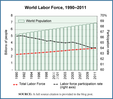
On the first day of May, International Labor Day, we thought it only right to report on the world labor force. The graph shows, as a red line, the number of people in the labor force worldwide from 1990 through 2011. These data come from the World Bank which defines the labor force as follows:

Total labor force comprises people ages 15 and older who meet the International Labour Organization definition of the economically active population: all people who supply labor for the production of goods and services during a specified period. It includes both the employed and the unemployed. While national practices vary in the treatment of such groups as the armed forces and seasonal or part-time workers, in general the labor force includes the armed forces, the unemployed, and first-time job-seekers, but excludes homemakers and other unpaid caregivers and workers in the informal sector.

The labor force is, of course, a subset of the overall population and so we’ve included world population on the graph, as well as labor force participation rates, annually. Over the period 1990–2011 the labor force participation rate has actually declined, slightly, from 66.32% to 64.18%. Yet the labor force has grown at a faster rate than has population overall, 39.3% for the participation rate versus 31.4% for world population. Growing longevity is part of the reason for this seeming divergence.

To labor and laboring, within or outside the official labor force!

Geographic reference: World
Year: 2011
Market size: 3.26 billion.
Source: “Labor Force, Total,” part of a data set maintained by The World Bank and available online here. World population data are from the United Nations, Department of Economic and Social Affairs, Population Division (2011).
Original source: The United Nations and The World Bank Group
Posted on May 1, 2013

U.S. Prison Population

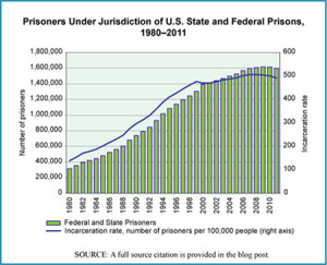
U.S. Prison Population, 1980-2011

The number of people in prison in the United States is the highest in the world when calculated in terms of number per capita. The U.S. incarceration rate as of December 31, 2011 was 492 people per 100,000 in the population, and this did not count those in jail, awaiting trial or serving very short sentences. Those in jail increase the total number incarcerated by three-quarters of a million people. The chart shows the number of prisoners in the United States, annually, between 1980 and 2011 and includes only those in federal or state prisons but not those in jail.

Today’s market size is the number of people in the United States under the jurisdiction of state or federal corrections authorities as of December 31, 2011. These are people convicted of a crime and serving a prison term.

Worth noting is the fact that 8% of those in prison (at the end of 2010) were housed in private prisons run for profit. Leaders in the private prison business are CCA (Corrections Corporation of America) and GEO Group, Inc. which together account for approximately half of the prison contracts in the United States. As of January 1, 2011, 31 states contracted with private companies to house a portion of their prisoners. Texas had the largest number of persons in privately run prisons, 19,155 or 11% of its prison population. New Mexico had the largest percentage of its prison population housed by private prisons, 43.6% or 1,503 prisoners.

Geographic reference: United States
Year: 2011
Market size: 1,598,780 people
Source: E. Ann Carson and William J. Sabol, “Prisoners in 2011,” December 2012, a Bulletin published by the U.S. Department of Justice, Bureau of Justice Statistics, and available online here. The figures related to private prisons come from Cody Mason, “Too Good to be True, Private Prisons in America,” The Sentencing Project, January 2012. The data for the graphic came from the above cited Department of Justice report as well as the Statistical Abstract of the United States, 2004–2005, page 208, “Table 338–Federal and State Prisoners, by Sex, 1980 to 2002,” Bureau of the Census.
Original source: U.S. Bureau of Justice Statistics and U.S. Census Bureau
Posted on April 4, 2013

High School Wrestlers

Our attention was caught last week by the announcement from the International Olympic Committee that it had recommended the elimination of wrestling from the Olympic Games starting in 2020. Their decision will not be ratified until later this year so one can expect to see wrestling fans around the world gathering their resources to defend the sport and its inclusion in the Olympic Games after the games of 2016. After all, wrestling was one of the original sports in the ancient games, has been in the modern games since they were reestablished in 1896 and wrestling is a recognized sport in 180 countries.

Today’s market size is the number of high school students participating in wrestling in the United States during the academic year, 2010-2011. In that school year, wrestling was the 6th most popular sport for high school males. The source document, linked to below, provides data on high school participation in all major sports programs.

Geographic reference: United States
Year: 2010-2011
Market size: 280,384
Source: “2011-2012 High School Athletics Participation Survey,” August 2012, available online here.
Original source: National Federation of State High School Associations
Posted on February 19, 2013

Intercountry Adoptions

Foreign Adoptions and Fertility Rates

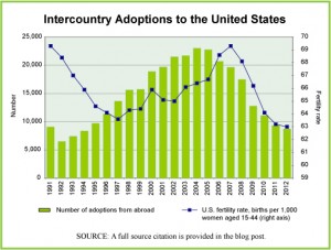
The decade between 1995 and 2005 was a high point in adoptions by U.S. citizens of children from other countries, as can be seen in the graph. Since then, the numbers of adoptions has plummeted despite growing waiting lists of U.S. citizens interested in adopting. The reasons for the decline are varied but explained this way in a report by Time magazine, “… a combination of forces in the developing world, from reform efforts to economic growth to resurgent nationalism, is turning the attitude against the practice, even in countries where kids may need the most help.”

Today’s market size, we use the term market loosely here, is the number of children adopted by U.S. citizens from abroad in 2004 (the peak year for intercountry adoptions) and 2012. The graph shows the number of children adopted in this way each year from 1991 through 2012 as well as the fertility rate in the United States for each of these years. The fertility rate is the number of children born for every 1,000 women of childbearing age, namely 15 to 44 years.

Geographic reference: United States
Year: 2004 and 2012
Market size: 22,991 and 8,668 respectively
Source: Kayla Webley, “The Baby Deficit,” Time, January 21, 2013, page 34. “Statistics – Adoptions by Year,” a report put out by the U.S. State Departments’ Bureau of Consular Affairs and available online here. “International Adoption Facts,” a report published by The Evan B. Donaldson Adoption Institute in 2002 and available online here. “National Vital Statistics Reports — Births: Final Data for 2010, August 28, 2012, U.S. Department of Health and Human Services, Centers for Disease Control and Prevention (CDC), available online here, with updates from another CDC report available here.
Posted on February 1, 2013

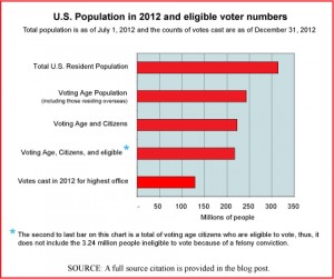
U.S. Electorate

Chart

Today’s market size is the size of the voting population in the United States based on electoral results from the 2012 national election. We chose this topic for today by way of recognition of yesterday’s inaugural ceremonies. The chart provides an interesting view of how the electorate relates to the overall population. If you’re interested in a comparison of voter turnout rates by state, the source material for this post is a table that presents a great deal of detail at the state level. A link to that material is provided below. The state with the highest voter turnout in 2012—as it is most election years—was Minnesota.

Geographic reference: United States
Year: 2012
Market size: 130,234,600 votes counted (as of December 31, 2012)
Source: Dr. Michael McDonald, “2012 General Election Turnout Rates,” December 31, 2012, The United States Election Project, the Department of Public and International Affairs, George Mason University, available online here. The data used to produce the graphic are from this GMU source as well as the U.S. Census Bureau.
Posted on January 22, 2013

College Enrollment

While we at ECDI don’t really see education as a market-driven endeavor, there is no question that educational services are an important part of the U.S. economy. Public expenditures on education account for between 5% and 6% of Gross Domestic Product (GDP) annually, as measured in value added. Educational services in the private sector account for another 1% to 1.5% of GDP. Today we look at enrollment in post-secondary educational institutions of all sorts in the United States as our market.

Several interesting details about 2011 college enrollment in the United States are these: of the total enrolled, more than half were females (55.2% versus 44.8%); most were full-time (73%); most were enrolled in public institutions (79%), and slightly more than half of the students were employed, either part-time (27.5%) or full-time (25.7%). For anyone interested in more details about this “market,” the source from which we obtained today’s market size—link provided below—offers a very detailed breakdown of college enrollment in the United States, by demographic characteristics as well as by type of institution and by years in school.

Geographic reference: United States
Year: 2011
Market size: 20.4 million
Source: “Table 5. Type of College and Year Enrolled for College Students 15 Years Old and Over, by Age, Sex, Race, Attendance Status, Control of School, Disability Status, and Enrollment Status: October 2011,” part of the Current Population Survey series produced and made available to us all by the U.S. Census Bureau on their website here.
Original source: U.S. Department of Commerce, Census Bureau.
Posted on November 30, 2012

Public School Students

School bus arrives on day 1

As the summer comes to a close and school-aged children head back to school we present the estimated number of children in the United States attending public elementary or secondary schools during the 2011-2012 academic year. Worth noting is the fact that, based on 2010 U.S. Census data, there were 53,980,105 people in the United States between 5 and 17 years of age, the age range of the majority of those in the elementary and secondary school system at the beginning of an academic year.

Geographic reference: United States
Year: 2011-2012
Market size: 49,255,742 students, 61.4% of whom were elementary level students and 38.6% secondary school level students.
Source: “Highlights Table 1. 2011–12 versus 2010–11: Estimates for 50 States and D.C. Statistics of Public Elementary and Secondary School Districts,” page 66. Rankings & Estimates, a report by the National Education Association (NEA) dated December 2011, available online here. The population figure mentioned above is from a U.S. Census Bureau report, available here.
Original source: NEA
Posted on September 4, 2012

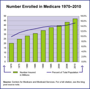
Medicare Enrollment

Medicare Enrollment Stats

Today is the 70th anniversary of the attack on Pearl Harbor. Today is also the final day of the Medicare annual enrollment period. Only one of these topics lends itself to a market size post. Worth noting—and by way of tying these two things together a little—is the fact that anyone (now an American citizen) who was around on the day that Pearl Harbor was attacked, is now eligible for Medicare.

Today’s market size is the number of people enrolled in the Medicare health insurance system in the United States in 2010. The graphic provides data on enrollment from 1970 to 2010 and shows how this population relates to the total U.S. population over this period.

Geographic reference: United States
Year: 2010
Market size: 47.2 million
Source: “Table I.1 Medicare Enrollment Trends,” part of the statistical offerings on the Federal Government’s CMS website here.
Original source: Center for Medicare and Medicaid Services, U.S. Department of Human Health and Services
Posted on November 7, 2011

Visitors to Midtown Detroit

In recent years, Midtown Detroit has seen an economic revival. The area is a major destination for visitors to Detroit. The number one destination is the main branch of the Detroit Public Library, followed by The Detroit Institute of Arts across the street. Data show the annual number of visitors.

Geographic reference: Midtown Detroit, Michigan
Year: 2010
Market size: Nearly 1.9 million people
Source: Doug McInnis, “Talk of the Town: Midtown Detroit Undergoes an Economic Revival,” Wayne State, July 2011, pages 10-19
Original source: University Cultural Center Association.

Crude Oil Supply

Based on a report recently issued by the U.S. Energy Information Administration, the supply of crude oil for U.S. energy needs, from all sources, is anticipated to decline between 2009 and 2025. On a per capita basis this decline is rather large, 15.3%. This is because the population is projected to increase by 16.4% between 2009 and 2025 while the supply of crude oil is forecast to decline by 1.39%. Obviously, new sources of petroleum supply will be (are) in high demand, not to mention all other forms of energy.

Today’s market size is the daily supply in millions of barrels per day (mbpd) of crude oil in the United States, for 2009 and projected for 2025.

Geographic reference: United States
Year: 2009 and 2025
Market size: In 2009, 14.33 mbpd and in 2025, 14.13 mbpd
Source: “Table C4. Liquid Fuel Supply and Disposition,” Annual Energy Outlook 2011, With Projections to 2035, April 2011, page 175, available online here.
Original source: U.S. Department of Energy, Energy Information Administration

Catholic Population

For this Ash Wednesday market size post, we looked up the size of the worldwide Catholic population, presented below. According to the source, half of all Catholics (49.4%) live in the Americas, a region of the world that contains about 14% of total world population.

Geographic reference: World
Year: 2009
Market size: 1.181 billion.
Source: “World Catholic Population Growing; Mixed Results on Priestly, Religious Vocations,” CatholicCulture.org, February 21, 2011, available online here.
Original source: Annuario Pontifico, 2011 edition, The Vatican.

Midwives in the United States

In honor of a friend of ours, on her birthday, we thought we’d post a market size about the number of births in the United States that are attended to by midwives. Many people believe that midwives deliver primarily babies born outside of hospitals but this is not true. The vast majority of the births attended to by midwives (96.7%) are hospital births. Overall, in 2006—the most recent year for which data are available—of the total number of births registered in the United States, 8.7% were attended to by a midwife. In Europe, by way of comparison, that percentage tends to be in the 75% range. Our friend, she is a midwife practicing at a hospital in France.

Geographic reference: United States
Year: 2006
Market size: Births attended by a midwife in the United States, 336,347 or 8.7% of all registered births
Source: “Trends and Characteristics of Home and Other Out-of-Hospital Births in the United States, 1990-2006,” National Vital Statistics Report, Volume 58, Number 1, March 3, 2010, available online here.
Original source: U.S. Department of Health and Human Services, Centers for Disease Control and Prevention, National Center for Health Statistics

Muslim Population

Today is Eid al Adha, an important Muslim holiday which marks the end of Hajj, the annual Muslim pilgrimage to Mecca. The name of this holiday is usually translated as “Festival of Sacrifice”. With a nod of recognition of this holiday we look today at the size of the Muslim population worldwide. We have always used the term “market” quite broadly on this site, measuring everything from the size of the market for cement to the size of the voting population and the size of the demand for pumpkins, jack-o-lanterns, and candy around Halloween.

The population size presented here is taken from a Pew Research Center report which provides a great deal of interesting information about Muslims around the word. A link to that report is provided in the source note below.

Geographic reference: World
Year: 2009
Market size: 1.57 billion
Source: “Mapping the Global Muslim Population; A Report on the Size and Distribution of the World’s Muslim Population,” The Pew Forum on Religion and Public Life, October 7, 2009, available online here.
Original source: Pew Research Center

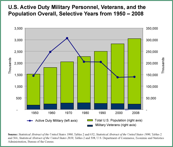
Veteran Population

Military Population

The number of military veterans in the United States is our focus on this Veterans Day.

The chart we present here shows three population figures over more than a half century: Active Duty Military, Military Veterans, and the overall population, by way of comparison. The veterans population is shown as the dark blue columns along the bottom of the chart.

We offer our sincere thanks to all those who have served—or are serving—this country in one of our military branches.

Geographic reference: United States
Year: 1980 and 2008
Market size: 28.6 million and 23.2 million respectively
Source: Statistical Abstract of the United States, editions 1980, 1990 and 2010. Recent editions are available online here.
Original source: U.S. Bureau of the Census