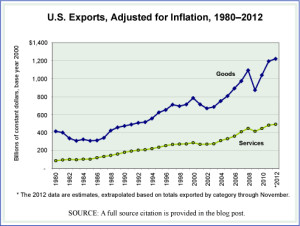
The expansion of international trade over the last two decades has trans- formed the world in many ways and led to what is commonly referred to as, simply, globalization. Today we look at U.S. exports annually since 1980, divided into all goods exported and all services exported. To see the trend clearly—not that it is subtle—we have prepared a graph that shows U.S. exports of goods and services in two separate lines. They are shown in constant dollars (base year 2000) so that the impact of inflation has been removed and what one sees is the actual rise in exports from the United States.
While services still make up a smaller share of all exports than do goods—30% in 2010, up from 17.5% in 1980—the United States exports more services than it imports. This gives service exports a positive trade balance, something not seen with goods exports since the mid-1970s. The services exported are broken into several large categories as follows, each with its share of total 2012 exports in parenthesis: Travel (20.6%); Passenger Fares (6.4%); Other Transportation (7.0%); Royalties and License Fees (19.5); Other Private Services (among these are financial services and computer services) (45.0%); Transfers under U.S. Military Sales Contracts (2.9%), and Misc. Government Services (0.2%).
Today’s market size is the value of exported goods and exported services from the United States in 2012.
Geographic reference: United States
Year: 2012
Market size: Goods, $1.564 trillion and Services, $623 billion
Source: “U.S. International Trade in Goods and Services, December 2012,” U.S. Bureau of Economic Analysis, February 8, 2013, available here. the graph was made with data from another Census Bureau report, “U.S. Trade in Goods and Services – Balance of Payments (BOP) Basis,” June 2012, available as either a PDF or Excel spreadsheet from their website here.
Original source: Two bureaus in the U.S. Department of Commerce; the Census Bureau and the Bureau of Economic Analysis
Posted on February 8, 2013

