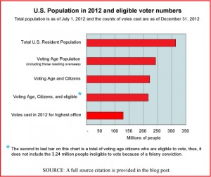
Today’s market size is the size of the voting population in the United States based on electoral results from the 2012 national election. We chose this topic for today by way of recognition of yesterday’s inaugural ceremonies. The chart provides an interesting view of how the electorate relates to the overall population. If you’re interested in a comparison of voter turnout rates by state, the source material for this post is a table that presents a great deal of detail at the state level. A link to that material is provided below. The state with the highest voter turnout in 2012—as it is most election years—was Minnesota.
Geographic reference: United States
Year: 2012
Market size: 130,234,600 votes counted (as of December 31, 2012)
Source: Dr. Michael McDonald, “2012 General Election Turnout Rates,” December 31, 2012, The United States Election Project, the Department of Public and International Affairs, George Mason University, available online here. The data used to produce the graphic are from this GMU source as well as the U.S. Census Bureau.
Posted on January 22, 2013

