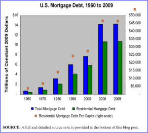
It should not come as a surprise to see that the U.S. has dramatically increased its national, total mortgage debt over the last few decades and in particular over the last decade. The graphic presented here shows the increase in national mortgage debt from 1960 to 2009. The most striking leaps in indebtedness are seen in the period since 2000. While not surprising since we all now understand that the last decade was indelibly marked by a housing bubble, it is sobering to see just how high that debt really is, well after the bubble has burst.
The graphic depicts inflation-adjusted dollars so what we see here is the increase in mortgage debt AFTER INFLATION. Just for fun, the graphic also shows—with an orange dot per year—residential mortgage debt on a per capita basis, using the right scale on the chart. We are certainly an indebted people.
Geographic reference: United States
Year: 2009
Market size: $14.3 trillion, of which $10.8 trillion is residential mortgage debt as opposed to commercial or agricultural mortgage debt.
Source: “Table 1191 — Mortgage Debt Outstanding by Type of Property Holder: 1952–2009,” Statistical Abstract of the United States: 2011, available online here.
Original source: Board of Governors of the Federal Reserve System, “Federal Reserve Statistical Release, Z.1, Flow of Funds Accounts of the United States,” March 2010, available online here.
Full source note for graphic: “Table 1191 — Mortgage Debt Outstanding by Type of Property Holder: 1952–2009,” Statistical Abstract of the United States: 2011; Population data 1960-1970: “No. HS-1. Population: 1900-2002,” available online here; Population data 1980-2009: “Table 7. Resident Population by Sex and Age: 1980 to 2009,” Statistical Abstract of the United States: 2011, page 11 available online here. The price deflator series used to convert current dollars to constant 2009 dollars came from two spreadsheets. For 1960: “Table 7.14. Chain-Type Quantity and Price Indexes for Gross Domestic Product by Sector,” Bureau of Economic Analysis, February 28, 2003 available online here; For 1970-2009: “Table B-6. —Chain-type quantity indexes for gross domestic product, 1962-2010,” Economic Report of the President: 2011 Spreadsheet Tables, U.S. Government Printing Office, available online here.


Quite a wonderfully illuminating chart. This is one of those bubbles I myself did not consciously see developing — so persistent and ancient has been the feeling in my guts that, of course, real estate values should appreciate. But when they stupid mule with a two-by-four, even the mule will finally ask. “Yeah, but why would that be?”