Gold Demand

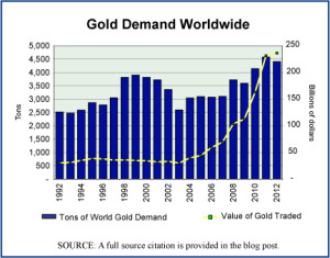
Gold demand trends worldwide, 1992-2012

The sharp rise in the price of gold since 2007 is a sign of how uncertain the financial world feels to many people since it went through a serious crisis in 2008. Although the United States abandoned the gold standard in 1933—thus severing the direct convertibility of the U.S. dollar for a set weight and quality of gold—gold is still seen as one of the precious metals that will hold its value during deflationary times or times when other investments are risky. The trade in gold tends to rise during uncertain times as does the price of gold. The annual average price of gold rose during the first decade of the century by 340%, from $279.1 per troy ounce to $1,224.5.

Today’s market size is the volume and value of gold traded in 2000 and in 2012. The graph shows what the global demand for gold has done annually over the period 1992–2012. The increased demand in the last few years has been large but not nearly as large as the rise in the price of gold.

Geographic reference: World
Year: 2000 and 2012
Market size: 3,818 tons valued at $34.26 billion and 4,405 tons valued at $236.40 billion respectively
Source: “Gold Demand Trends, Full Year 2012,” February 2013, World Gold Council, available online here. The graph was produced with data from this same report, as well as the earlier editions of the same, from 1996 and 2005, both of which are available on the same WGC website cited above.
Original source: LBMA, Thomson Reuters GFMS, and World Gold Council
Posted on February 28, 2013

Alternative Pet Care Services

With the slow economy, many Americans are cutting back on spending in many areas of their lives. Among pet owners, spending on pets does not seem to be one of these areas. In 2012, pet owners spent $53 billion on pet food, veterinary care and other pet-related services, up 5 percent from 2011. Included in this spending was alternative veterinary care services such as acupuncture.

Today’s market size shows the amount spent by pet owners in the United States on alternative veterinary care in 2012.

Geographic reference: United States
Year: 2012
Market size: $12.5 billion
Source: “Los Angeles: Americans Spent $53B on Pets in 2012,” Lansing State Journal, February 24, 2012, page 5A.
Original source: USA Today
Posted on February 26, 2013

Office Supply Stores

The news last week that OfficeDepot and OfficeMax, two of the big three office supply retailers, are planning to merge made us think that a look at retail sales in this sector might be interesting. Sales made through stores dedicated to office supplies and stationery—an industry identified by the U.S. Census Bureau with the industry code NAICS 45321—have not been keeping up with the growth in retail sales generally since 2000. The 1990s were a period of strong growth for these retailers. Big box stores were spreading and doing well. Growth began to slow in the early 2000s and has declined each year since 2007, with the onset of a recession in December of that year.

Between 2000 and 2012, total retail sales in the United States—less auto-related sales—rose 58.6% while sales through office supply stores declined by 16.6%. Many factors are contributing to this decline. Primary among them are factors related to how we buy office supplies and not so much the volume of the supplies that we buy. The rising power of retailers with more general merchandise lines (Costco, Wal-Mart, etc.) is one significant factor as is the rise of online shopping.

Today’s market size is the value of sales at Office Supply and Stationery Stores in the United States in 1992, 2000, and 2012.

Geographic reference: United States
Year: 1992, 2000, 2012
Market size: $9.184, $22.75 and $19.11 billion respectively
Source: “Estimates of Monthly Retail and Food Services Sales by Kind of Business: 2012,” February 13, 2013, part of a series published by the U.S. Census Bureau monthly, and available here.
Original source: U.S. Department of Commerce, Bureau of the Census
Posted on February 25, 2013

Container Ships

The sharp rise in global trade over the last decades has been a boon to the shipping industry. The number of large container ships, which move so much of the increased quantity of partially and/or fully finished products being traded internationally, has grown and that growth is anticipated to continue through 2016 according to the World Shipping Council. The size of those ships is also on the rise.

The capacity of container ships—referred to in the trade as cellular vessels as they are designed to efficiently load and store freight containers one on top of the other with vertical braces at the four corners—is measured in terms of twenty-foot equivalent units (TEUs), or the number of twenty-foot containers that the vessel can carry (these containers measure 20′ x 8′ x 8’6″). In the year 2000, the world fleet of container ships was primarily made up of ships with a capacity of 1,000 or fewer TEUs. Vessels this size made up approximately three-quarters of the world fleet. In 2012, they represented less than 30% of the fleet with much larger vessels dominating the trade. While the number of ships rose by only 2.8% between 2000 and 2012, the fleet’s carrying capacity almost tripled, rising 182%. So, the average per container ship capacity went from 1,200 TEUs in 2000 to 3,295 in 2012.

Today’s market size is the number and carrying capacity of cellular shipping vessels worldwide in 2000, in 2012, and a projection for where this fleet will stand in 2016.

Geographic reference: World
Year: 2000, 2012, 2016
Market size: Number of ships respectively: 4,828; 4,961 and 5,433
Market size: Carrying Capacity in million TEUs: 5.8; 16.34 and 19.83
Source: “Container Ship Types,” GlobalSecurity.org, July 7, 2011, available online here. “Cellular Fleet Forecast,” Alphaliner, February 2013, available online here.
Original source: Alphaliner
Posted on February 21, 2013

Plug-In, Electric Cars

Tesla booth at Detroit Auto Show

Today’s market size is the number of electric plug-in cars purchased in the United States in 2012. Plug-in electric cars come in two varieties, an all-electric version like the Tesla Model S and a hybrid electric and gas engine version such as the Chevy Volt. The electric and gas engine variety is similar to more conventional hybrid cars but has a much larger battery and can, as the name implies, be plugged into an electric outlet for charging. By contrast, most cars referred to simply as hybrids (non-plug-ins) use a battery system to assists the primary gas engine and they charge that battery internally by capturing energy from the operation of the engine itself.

The world of cars is changing, perhaps slowly but it is changing. In 2012, plug-in electrics represented 0.51% of all sales of automobiles in the United States and 11.6% of all hybrid car sales.

Geographic reference: United States
Year: 2012
Market size: 50,804 plug-in electric cars
Source: JC Reindl, “LG CHEM: Battery Industry’s Future Questioned After Report,” Detroit Free Press, February 17, 2013, page 1.
Posted on February 20, 2013

High School Wrestlers

Our attention was caught last week by the announcement from the International Olympic Committee that it had recommended the elimination of wrestling from the Olympic Games starting in 2020. Their decision will not be ratified until later this year so one can expect to see wrestling fans around the world gathering their resources to defend the sport and its inclusion in the Olympic Games after the games of 2016. After all, wrestling was one of the original sports in the ancient games, has been in the modern games since they were reestablished in 1896 and wrestling is a recognized sport in 180 countries.

Today’s market size is the number of high school students participating in wrestling in the United States during the academic year, 2010-2011. In that school year, wrestling was the 6th most popular sport for high school males. The source document, linked to below, provides data on high school participation in all major sports programs.

Geographic reference: United States
Year: 2010-2011
Market size: 280,384
Source: “2011-2012 High School Athletics Participation Survey,” August 2012, available online here.
Original source: National Federation of State High School Associations
Posted on February 19, 2013

Aircraft

Commercial Airline Fleet numbers

Upon the news of the merger of American Airlines and U.S. Airways, creating in the process the largest passenger air carrier in the world, our attention is again drawn to the commercial airline industry. It has been a very rocky century so far for this industry.

In late 2011, the parent company of American Airlines, AMR, filed for bankruptcy protection, making American Airlines the last of the big six U.S. airlines to file for bankruptcy protection since the turn of the century (they are listed below). The use of commercial, passenger aircraft as missiles in the September 11, 2001 attacks in the United States can be seen as the first of many disruptions to the system, disruptions that included a worldwide financial crisis and a region-wide shutdown of air traffic due to the threat posed by volcanic ash. Underlying all of this has been the steady increase in the price of jet fuel which now makes up just over one-third of operating expenses for the industry as a whole.

Today’s market size is the number of aircraft being operated by U.S. air carriers. This number does include aircraft used for freight (12.3%) but does not include private jets or the fleets operated by small companies offering nonscheduled, special order flights. The graph shows how the industry fleet size has changed over the past 17 years. A line is also provided on the graph that shows the average, industry-wide, passenger load factor each year (PLF). The PLF is a calculation of Revenue Passenger Miles (RPM) divided by Available Seat Miles (ASM).

Geographic reference: United States
Year: 2001 and 2011
Market size: 8,497 and 7,185 aircraft respectively
Source: “TABLE 2-6. Number of U.S. Aircraft, Vehicles, and Other Conveyances: 2004-2009,” Transportation Statistics Annual Report-2010, Research and Innovative Technology Administration (RITA) – U.S. Department of Transportation (US DOT), available online here. Data for 2010 and 2011 are from an article by Aaron Karp, “FAA: US Commercial Aircraft Fleet Shrank in 2011,” March 13, 2012, Airports Today, available online here. The data on passenger load factors in the graph are from another report by the Bureau of Transportation Statistics, available online here.
Original source: U.S. Bureau of Transportation Statistics, Federal Aviation Agency

Largest Bankruptcy Filings in the U.S. Airline Industry since 2000

TWA (2001)
U.S. Airways (2002)
United Airlines (2002)
Delta Air Lines (2006)
Northwest Airlines (2006)
AMR (American Airlines) (2011)

Posted on February 14, 2013

Prostitution

Today we look at what is in most places a black market, prostitution. A recent article in The New York Times about a program designed to help prostitutes in Israel escape from dependence on prostitution provided the market size we post today. It is the estimated value of the prostitution business, annually, in Israel. Interestingly, prostitution is not a criminal offense in Israel, although running a brothel or operating as a pimp are illegal activities.

Geographic reference: Israel
Year: 2011
Market size: $500 million
Source: Isabel Kershner, “Prostitutes in Israel Are Finding New Lives in Training for the Fashion World,” The New York Times, January 4, 2013, page A9.
Posted on February 12, 2013

U.S. Exports

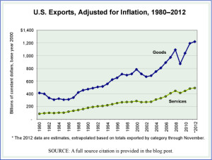
US Exports in Goods and Services Annually 1980-2012

The expansion of international trade over the last two decades has trans- formed the world in many ways and led to what is commonly referred to as, simply, globalization. Today we look at U.S. exports annually since 1980, divided into all goods exported and all services exported. To see the trend clearly—not that it is subtle—we have prepared a graph that shows U.S. exports of goods and services in two separate lines. They are shown in constant dollars (base year 2000) so that the impact of inflation has been removed and what one sees is the actual rise in exports from the United States.

While services still make up a smaller share of all exports than do goods—30% in 2010, up from 17.5% in 1980—the United States exports more services than it imports. This gives service exports a positive trade balance, something not seen with goods exports since the mid-1970s. The services exported are broken into several large categories as follows, each with its share of total 2012 exports in parenthesis: Travel (20.6%); Passenger Fares (6.4%); Other Transportation (7.0%); Royalties and License Fees (19.5); Other Private Services (among these are financial services and computer services) (45.0%); Transfers under U.S. Military Sales Contracts (2.9%), and Misc. Government Services (0.2%).

Today’s market size is the value of exported goods and exported services from the United States in 2012.

Geographic reference: United States
Year: 2012
Market size: Goods, $1.564 trillion and Services, $623 billion
Source: “U.S. International Trade in Goods and Services, December 2012,” U.S. Bureau of Economic Analysis, February 8, 2013, available here. the graph was made with data from another Census Bureau report, “U.S. Trade in Goods and Services – Balance of Payments (BOP) Basis,” June 2012, available as either a PDF or Excel spreadsheet from their website here.
Original source: Two bureaus in the U.S. Department of Commerce; the Census Bureau and the Bureau of Economic Analysis
Posted on February 8, 2013

Desalination Plants

In a process known as desalination (or desalinization), salt and other minerals are removed from seawater to produce fresh water suitable for human consumption. As world population rises the demand for fresh water rises even more rapidly since fresh water is used for more than direct human consumption. It is used in agriculture for both crop and livestock production as well as in industrial and mining operations. In particular, a growing quantity of water is being used around the world to extract oil, in both conventional oil well operations and, more notably yet, in hydraulic fracking operations used to extract oil and natural gas from sand tars and shale deposits.

The demand for desalinated water is rising at an estimated rate of 9% per year and is expected to continue to grow at this high rate for some time to come. Desalination plants around the world today produce approximately 65.2 million cubic meters of fresh water per day (24 billion m3 per year), which is equivalent to 0.6% of global water supply.

Today’s market size is an estimate of the money that will be invested to build new desalination plants worldwide between 2010 and 2016. Parts of the Middle East and North Africa are particularly invested in desalination technology, being regions particularly vulnerable to water shortages. In Saudi Arabia, for example, 70% of the total volume of drinking water consumed is supplied through the use of desalination technologies. The Middle East and North Africa are expected to see the largest share of the investments in desalination plants during the period shown here.

Geographic reference: World
Year: 2010–2016
Market size: $88 billion
Source: Water Desalination Using Renewable Energy, Technology Brief 115, March 2012, pages 3-4, available online here. “Saudi Per Capita Water Consumption 91% Higher Than International Average,” Saudi Gazette, September 1, 2012, available here.
Original source: The International Renewable Energy Agency (IRENA) and the International Energy Agency (IEA)
Posted on February 5, 2013

Intercountry Adoptions

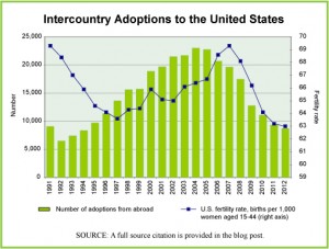
Foreign Adoptions and Fertility Rates

The decade between 1995 and 2005 was a high point in adoptions by U.S. citizens of children from other countries, as can be seen in the graph. Since then, the numbers of adoptions has plummeted despite growing waiting lists of U.S. citizens interested in adopting. The reasons for the decline are varied but explained this way in a report by Time magazine, “… a combination of forces in the developing world, from reform efforts to economic growth to resurgent nationalism, is turning the attitude against the practice, even in countries where kids may need the most help.”

Today’s market size, we use the term market loosely here, is the number of children adopted by U.S. citizens from abroad in 2004 (the peak year for intercountry adoptions) and 2012. The graph shows the number of children adopted in this way each year from 1991 through 2012 as well as the fertility rate in the United States for each of these years. The fertility rate is the number of children born for every 1,000 women of childbearing age, namely 15 to 44 years.

Geographic reference: United States
Year: 2004 and 2012
Market size: 22,991 and 8,668 respectively
Source: Kayla Webley, “The Baby Deficit,” Time, January 21, 2013, page 34. “Statistics – Adoptions by Year,” a report put out by the U.S. State Departments’ Bureau of Consular Affairs and available online here. “International Adoption Facts,” a report published by The Evan B. Donaldson Adoption Institute in 2002 and available online here. “National Vital Statistics Reports — Births: Final Data for 2010, August 28, 2012, U.S. Department of Health and Human Services, Centers for Disease Control and Prevention (CDC), available online here, with updates from another CDC report available here.
Posted on February 1, 2013

Hardware Stores

Today’s market size is the value of sales made through hardware stores in the United States in 2011. Sales were down slightly from 2008 (0.06%) but higher than sales in 2009 and 2010. Hardware stores as measured here do not include large building supply stores such as Home Depot or Lowes. For those familiar with the industrial coding system [North American Industrial Classification System – NAICS] used by the U.S. Census Bureau, as well as the corresponding data gathering agencies in Canada and Mexico, this industry is number 44413.

Geographic reference: United States
Year: 2011
Market size: $20.13 billion
Source: “Annual Revision of Monthly Retail and Food Services: Sales and Inventories—January 1992 through March 2012,” Monthly & Annual Retail Trade, available online here.
Original source: U.S. Department of Commerce, Bureau of the Census
Posted on January 31, 2013

Guns

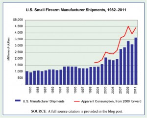
U.S. Manufacturer Shipments, 1982-2011

A tragic mass shooting at the end of 2012 has brought on another round of debates in the United States about whether there should be—and if so what sort of—limits on the private ownership of guns. The United States has the most well-armed population in the world, by far. There are an estimated 0.88 firearms per person in the United States. The country with the next greatest number of firearms per capita is Yemen, with 0.55. Guns are big business in the United States.

Today’s market size is the 2011 value of shipments by U.S. small firearms manufacturers, those engaged primarily in making small arms that are carried and fired by individuals [NAICS 33-2994]. Thus, these are not the manufacturers of large, military weaponry but rather the makers of guns sold to individuals.

The U.S. gun manufacturing business has been growing rapidly over the last decade, rising 163% between 2001 and 2011. The graph we present here shows manufacturer shipment data for each year from 1982 through 2011. The red line on the graph shows the apparent consumption of small firearms starting in 2000. Apparent consumption is the wholesale value of manufacturing, less the value of exports, plus the value of imports.

Geographic reference: United States
Year: 2011
Market size: $3.634 billion [the value of product shipments was $3.246 billion, thus excluding any revenue from other services or leases provided by small firearm manufacturers]
Source: Arsen J. Darnay, Editor, Manufacturing and Distribution USA, “NAICS 332994 – Small Arms Manufacturing,” Gale Group, 2000, page 1984. Joyce P. Simkin, Editor, Manufacturing and Distribution USA, Seventh Edition, “NAICS 332994 – Small Arms Manufacturing,” Gale Cengage Learning, 2013, page 930. Data for 2010 and 2011 are from the most recent Annual Survey of Manufacturers, report published by the U.S. Census Bureau and available online here. Finally, the per capita data cited above come from: Simon Rogers, “Gun Homicides and Gun Ownership Listed by Country,” posted on July 22, 2012, on The Guardian website here.
Original source: U.S. Department of Commerce, Bureau of the Census, U.S. Department of Commerce, International Trade Administration (ITA) and the United Nations Office on Drugs and Crime (UNODC)
Posted on January 29, 2013

I.R.A. Money

Over the last several decades significant changes have been made to how the majority of people in the United States save for retirement. Getting reliable statistics on the topic, covering several decades, is difficult because of the very structural changes which have occurred in the ways that we save for retirement. The sort of pension plans that used to be regularly offered by large companies—plans in which an employee was promised a defined monthly payout after retirement—are fast disappearing in favor of hybrid plans that offer employees a framework in which they are the primary if not only investors, thus 401(k) and other similar plans. To illustrate the speed of change in this rush away from traditional pension plans, a glimpse at the coverage offered by the largest of firms, those most likely to offer such plans. In 1998, 90% of the companies in the Fortune 100 provided their new employees with a traditional pension. In 2012, that number had fallen to 30%.

In the absence of more traditional pension plans, many people are establishing independent retirement accounts or I.R.A.s to help them save for retirement. Today’s market size is the value of all money invested in an I.R.A. account in the United States as of October 31, 2012. Worth noting is the fact that this balance is higher than the balances of all the other retirement investment categories, such as 401(k) and 403(b) plans (with a balance of $5 trillion) or government employee retirement plans ($4.8 trillion) or the traditional pension plans offered by private sector employers ($2.6 trillion).

In looking at this market, please note that people often roll money into an I.R.A. account from funds in an employer-sponsored retirement plan when terminating employment with that company. These often large sums are part of the market being looked at here. Complicating matters further is the fact that there are oddities in the rules defining how investments are made into I.R.A.s, oddities which allow for more… creative investments in I.R.A.s by some. An extreme example of this came to light last summer, during the presidential campaign, when it was reported that candidate Romney’s I.R.A. account was valued at around $100 million. Since there are limits on how much may be contributed annually to such an account, speculation about the Romney I.R.A. balance ran rampant. But, for our purposes here, it is enough to say that the total balance invested in I.R.A. accounts includes such… anomalies. So, to put this national I.R.A. account balance into perspective, let us add that as of May 2011, 38.8% of all U.S. households had some sort of I.R.A. account. Furthermore, the I.R.A. balance of the median American family that did have an I.R.A. account in 2011 was $42,500.

Geographic reference: United States
Year: October 31, 2012
Market size: $5.3 trillion
Source: Ron Lieber, “Finding Advice for More Modest Retirement Investments,” The New York Times, January 19, 2013, page B1. Emily Brandon, “Top Companies Continue to Drop Pensions,” U.S. News & World Report, the Money section, available online here. William D. Cohan, “The Secret Behind Romney’s Magical IRA,” Bloomberg News, July 15, 2012, available online here.
Original source: Investment Company Institute, Towers Watson
Posted on January 24, 2013

U.S. Electorate

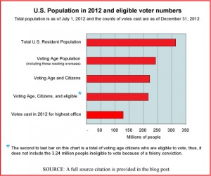
Chart

Today’s market size is the size of the voting population in the United States based on electoral results from the 2012 national election. We chose this topic for today by way of recognition of yesterday’s inaugural ceremonies. The chart provides an interesting view of how the electorate relates to the overall population. If you’re interested in a comparison of voter turnout rates by state, the source material for this post is a table that presents a great deal of detail at the state level. A link to that material is provided below. The state with the highest voter turnout in 2012—as it is most election years—was Minnesota.

Geographic reference: United States
Year: 2012
Market size: 130,234,600 votes counted (as of December 31, 2012)
Source: Dr. Michael McDonald, “2012 General Election Turnout Rates,” December 31, 2012, The United States Election Project, the Department of Public and International Affairs, George Mason University, available online here. The data used to produce the graphic are from this GMU source as well as the U.S. Census Bureau.
Posted on January 22, 2013

Fossil Fuel Subsidies

Since the turn of the century the price of crude oil has risen sharply, the result of increasing demand for a commodity whose supply cannot increase quickly enough to meet demand. The dynamics of the petroleum market are becoming more clearly those of a market for something with a finite supply. This may seem obvious since petroleum in the form of crude oil is a finite product but for the 130 years before 2000, oil markets did not follow this pattern. The oil market was more elastic, reacting more quickly to rising and falling demand. This is because during that first 130 years of the oil age, the more easily and inexpensively accessible oil was being extracted, making the market function more like that of a commodity with nearly endless supply. As we have entered a period in which global oil production has plateaued, despite rising demand, prices have risen sharply and they are likely to continue to rise as growing demand outpaces supply.

Today’s market size looks at the amount spent globally on fossil fuel consumption subsidies. These are defined by the International Energy Agency (IEA) as “any government action directed primarily at the energy sector that lowers the price paid by energy consumers.” According to the IEA, changes in international fuel prices are chiefly responsible for differences in subsidy costs from year to year. The 30% year-over-year increase in the amount spent on fossil fuel consumption subsidies in 2011 closely tracked the sharp rise in international fuel prices.

Geographic reference: World
Year: 2011
Market size: $523 billion
Source: John Parnell, “IEA: Fossil Fuel Subsidies Increased 30% in 2011,” Climate Home, December 11, 2012, available online here.
Original source: International Energy Agency (IEA)
Posted on January 17, 2013

E-Cigarettes

Electronic cigarettes are devices designed to release nicotine vapor without actually burning tobacco, thus, without smoke. They are battery operated devices which look like cigarettes but use a battery to produce heat which then atomizes the nicotine in a specially made cartridge. While still a small fraction of the size of the cigarette market, the market for e-cigarettes is expected to grow rapidly.

Today’s market size is the estimated total value of e-cigarette sales in the United States in 2013.

Geographic reference: United States
Year: 2013
Market size: $1 billion
Source: Josh Sanburn,”A Quitter’s Market, Electronic-cigarette Sales Are Up, and Big Tobacco Wants In,” Time, January 21, 2013, page 19.
Original source: USB; Wells Fargo; Tobacco Vapor Electronic Cigarette Association
Posted on January 15, 2013

Cuban Imports

On the whole the United States has been a supporter and booster of free trade and globalization since the end of the second World War and with increased energy since the 1990s. Yet with one neighboring country, Cuba, trade relations have been unusual. The frictions in trade between the United States and Cuba date back to the 1950s and the Cuban Revolution, followed by a forty-year trade embargo imposed by the United States. In 2000, President Clinton signed the Trade Sanctions Reform and Export Enhancement Act which opened the door for some restrictive trade with Cuba, specifically, U.S. exports of farm and forestry products and some medicines. The act did not open the door for any imports from Cuba.

Today’s market size is the total value of products exported from the United States to Cuba in 2000, 2008, and 2011. The drop in exports from 2008 to 2011 is largely the result of the fact that under the restrictions imposed on this trade, Cuba is required to pay in advance for all U.S. imports in cash, something that became much harder as the financial crisis of 2008 took hold. By way of placing this level of international trade into perspective, according to CIA estimates, Cuba’s imports in 2011, from all over the world, totaled $14 billion.

Geographic reference: United States and Cuba
Year: 2000, 2008, 2011
Market size: $1.3, $711.5, and $363.3 million
Source: “2011 Exports of NAICS Total All Merchandise,” and interactive, online data resource published by the International Trade Administration and available online here. “The World Factbook,” entry on Cuba, published by the U.S. Central Intelligence Agency and make available online here.
Original source: ITA (U.S. Department of Commerce, International Trade Administration) and the CIA
Posted on January 11, 2013

Office Coffee Service

The market for office coffee service—this service, often abbreviated OCS, provides companies with the hardware and consumables needed to supply their employees and guests with hot beverages, usually coffee—declined during the recession of 2007-2009 but began to grow again in 2011. This turnaround occurred more quickly than did the rebound for the larger vending machine contractors industry generally. Credit is given by the industry to its ability to be flexible and to alter its offerings. In particular, the rising popularity of single-cup systems has helped the industry to weather economic cycles throughout the first decade of the 2000s.

Today’s market size is the value of the office coffee service market in 2011, a figure that was forecast to rise by 3.5% in both of the following two years.

Geographic reference: United States
Year: 2011
Market size: $4 billion
Source: “Report: Office Coffee Sales To Increase 3.5 Percent Annually in 2012 and 2013,” February 21, 2012, Vending Marketwatch, available online here.
Original source: Packaged Facts
Posted on January 10, 2013

U.S. Active Duty Military

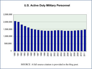
Active Duty Military, 1990-2011

Today’s market size is the size of the population of U.S. active duty military personnel. The chart to the right shows active duty military personnel figures from 1990 through August of 2011. The declining trend in this population, which appears clearly in the chart, is somewhat surprising given the United States’ involvement in “hostilities” in several parts of the world since 1990. One can see what appears at first blush to be a similarity with the economy at large in terms of reduced demand for labor and increased outsourcing. However, we only mention this seeming similarity here because such an assertion would require far more study and analysis to either present properly or disprove.

Geographic reference: United States
Year: 2010
Market size: 1.43 million
Source: “Table 510. Department of Defense Personnel: 1960 to 2010,” 2012 Statistical Abstract of the United States, page 335, available online through the Census Bureau’s website, here.
Original source: U.S. Department of Commerce, Bureau of the Census and the U.S. Department of Defense.
Posted on January 7, 2013