Library Spending

Library-interior

Today’s market size is the dollar amount spent, worldwide, by libraries on content. “Content” in this context refers to all material, physical or digital, purchased by libraries to become a part of their offerings.

Geographic reference: World
Year: 2011 and estimates for 2013
Market size: $23.78 billion and $24.79 billion respectively
Source: Andrew Neilson, “Content Spending by Library Type and Geography, 2011,” The Rise of eBooks: Global eBooks Trends, Elsevier, June 23, 2013, available online here. The photo comes from this website and is an interior shot of the Washington State Library.
Original source: Outsell, Inc.
Posted on February 27, 2014

Refugees

The number of people in the world who have been displaced from their countries due to war, persecution, or natural disaster is hardly what one might think of as a market. And yet those involved in helping this unfortunate population—as it awaits the opportunity to return home or seeks a way to resettle in a new home—may view it in ways quite similar to a growing market.

According to the UN Refugee Agency, the UNHCR, the total number of refugees in the world at the end of 2012 was 45.2 million. This included 28.8 million people displaced within their own countries, 15.4 million international refugees and nearly one million people in the process of seeking asylum. This figure represented a 20 year high, however, it has done nothing but rise ever since. The ongoing civil war in Syria has lead to a massive exodus from that country, a flow which has only increased since the end of 2012.

Today’s market size is the approximate number of Syrian refugees being housed in Turkey as of the middle of 2013 and a projected figure as of the end of 2014. Already in 2012, Turkey supplanted the United States on the list of top ten nations by the number of refugees hosted, taking over the tenth spot on that list.

Geographic reference: Turkey
Year: mid-2013 and a projection for the end of 2014
Market size: 400,000 and 1.5 million respectively
Sources: (1) Mac McClelland, “Container City,” New York Times Magazine, February 16, 2014, pgs. 24-31. (2) “Statistics — 2012 UNHCR Statistics Yearbook,” a summary online at this UN website.
Original source: United Nations Refugee Agency
Posted on February 19, 2014

Training Doctors

The education and training of a doctor is a long and costly endeavor. First comes the classroom education, the cost of which is picked up, for the most part for those not fortunate enough to get a scholarship, by the future doctor him or herself. Then comes a final on-the-job training period in which doctors with new diplomas spend four or more years working in a residency program.

During this residency, doctors in training see and treat patients under the supervision of more seasoned physicians. Most of these residency programs are carried out in teaching hospitals, which account for approximately 20% of the nation’s hospitals. Residency programs are arduous. Residents are expected to routinely work 80 hours a week and they are paid half or far less of what they will receive for much the same work after the residency. This training is expensive for the system as a whole and has been, for all practical purposes, nationalized.

The U.S. federal government pays for most of this training with money from the Medicare and Medicaid systems. Our market size today is the money spent by the federal government annually to support this graduate medical education.

Geographic reference: United States
Year: 2012
Market size: $11.5 billion of U.S. government funds are used to support residency slots in training hospitals, approximately 115,000 in 2012
Source: Catherine Dower, “Graduate Medical Education,” a health policy brief published in Health Affairs, on August 31, 2012 and available online here.
Original source: U.S. Department of Health and Human Services, Center for Medicare and Medicaid Services
Posted on January 22, 2014

Spending on Water and Sewer

Water-Sewer

One of the basic infrastructural needs of any modern society, particularly one in which the density of population is great, such as in urban areas, is that which supplies clean water and carries waste away. It is one of those things that in modern industrial society we take very much for granted and almost don’t notice it, until something isn’t working.

Today’s market size is the amount spent by residents, in the United States, for water supply and sanitation in 1990 and again in 2012. This does not include the expenditures of companies or other entities for water and sewer services but is, rather, the total spent by individuals for personal use. The graph provides a year-by-year picture of these expenditures in constant 2010 dollars, in other words, in inflation-adjusted terms. A red line on the graph is there to show how the population has risen over this period and it is clearly at a rate much slower than the rate of growth in expenditures on water.

Geographic reference: United States
Year: 1990 and 2012
Market size: $27.1 and $85.9 billion respectively (in current dollars)
Source: “Table 2.5.5 Personal Consumption Expenditures by Function (A),” National Income and Product Accounts Tables, (NIPA), Bureau of Economic Analysis, August 7, 2013, available from the BEA web site here.
Original source: U.S. Department of Commerce, Bureau of Economic Analysis
Posted on January 20, 2014

Spending on Internet Access

Today’s market size is the amount that was spent in the United States on Internet access in 2005 and in 2012. The increased spending from 2005 to 2012, after inflation, was 154% while the increased penetration of Internet access as a percent of the U.S. population grew by only 19% (from approximately 68% to 81%). Clearly, something other than a rising rate of Internet connectivity in the population is behind the rapidly rising national expenditure on Internet connectivity. The increased expenditure is most likely related to the changing infrastructure used to access the Internet. Users are shifting from dial-up connections to more costly, higher speed connections such as DSL (Digital Subscriber Line), Cable Internet access, Satellite Internet access and mobile broadband via cell phone service.

Geographic reference: United States
Year: 2005 and 2012
Market size: $29.7 billion and $80.7 billion respectively
Sources: (1) “Table 2.4.5 Personal Consumption Expenditures by Type of Product,” National Income and Product Accounts Tables, (NIPA), U.S. Bureau of Economic Analysis, August 7, 2013, available from the BEA web site here. (2) “Percent of Individuals Using the Internet 2000–2012,” ITU, available here.
Original source: U.S. Department of Commerce, Bureau of Economic Analysis, International Telecommunications Union (ITU), Federal Communications Commission (FCC)
Posted on January 14, 2014

Farms

Farms

It takes far fewer acres to produce the food we need and in the United States the total number of acres used in agriculture have been shrinking for decades, while output has grown. The number of farms has also been shrinking as larger and more industrial-sized farms have come to dominate the market.

These trends in farming can be seen in the graph. It shows the number of farms and the average size of U.S. farms each decade since 1940. What we thought was of interest is the fact that there has been a small change in the century-long trend of growing average farm size. Since 1990, the average size of farms has actually shrunk, slightly, from 460 acres to 418 acres. There was also a slight increase in the number of farms between 2000 and 2010. The relatively small movement back to family or small-scale farming, and in particular organic farming, is large enough to be visible in the national statistics and on the size of the average farm in the United States.

Today’s market size is the total number of farms in the United States in 1990 and 2010 as well as the total value of farm output in those two years.

Geographic reference: United States
Year: 1990 and 2010
Market size: 1990: 2,146 farms with output valued at $180 billion
Market size: 2010: 2,201 farms with output valued at $300 billion
Sources: (1) “Table 824. Farms—Number and Acreage: 1990 to 2010,” Statistical Abstract of the United States: 2012, U.S. Census Bureau, December 2011, page 536, available online here. (2) “Table 1101. Farms—Number and Acreage: 1959 to 1989,” Statistical Abstract of the United States: 1990, U.S. Census Bureau, January 1990, page 638. (3) “Series K 1-16. Farm Populations, Land in Farms, and Value of Farm Property and Real Estate: 1850 to 1970,” Statistical Abstract of the United States: Colonial Times to 1970, U.S. Census Bureau, September 1975, page 457.
Original source: U.S. Department of Commerce, Bureau of the Census
Posted on January 10, 2014

Charter Schools

The National Education Association defines charter schools as follows: “Charter schools are publicly funded elementary or secondary schools that have been freed from some of the rules, regulations, and statutes that apply to other public schools, in exchange for some type of accountability for producing certain results, which are set forth in each charter school’s charter.” The first charter school was established in Minnesota in 1991 as a part of ongoing educational reform efforts and more specifically, an expansion of market-based school reform. Proponents of charter schools claim that they bring much needed entrepreneurial spirit and a competitive ethos to public education. Opponents claim that to outsource the running of public schools to private entities is to redirect already scarce resources to service fees and profits while creating new layers of administration.

Since the first charter school was established in Minnesota, 40 additional states have passed legislation permitting the formation of charter schools and the number of such schools has grown with each passing year. The formation of Education Management Organizations (EMOs), both nonprofit and for-profit, has been one result of the legislation enabling charter schools. Some EMOs are now quite large, managing dozens of schools while others manage a single school. The diversity of this category of management companies is quite extreme. While not all charter schools are operated by EMOs, in the academic year 2011-12 such EMOs accounted for approximately 39% of all charter schools and 50% of all students enrolled in charter schools. And of the nearly one million students enrolled in EMO-run schools that year, 51% were enrolled in for-profit EMOs.

Today’s market size is the total number of charter schools operating in the United States in the academic years beginning in 2000 and 2010. While charter schools still make up a very small percentage of all public schools in the country (5.3%), it is an area that some people feel holds great promise for further privatization of government services.

Geographic reference: United States
Year: School year starting in the fall of 2000 and 2010
Market size: 1,993 and 5,274 respectively
Sources: (1) “Charter Schools,” a fact sheet on the National Education Association web site from which we quote the definition of these schools, available online here. (2) Gary Miron and Charisse Gulosino, Profiles of For-Profit and Nonprofit Education Management Organizations, November 2013, National Education Policy Center, available online here. (3) Tables 71, 98, and 161 from chapter two of the Digest of Education Statistics: 2012, published by the NCES in 2013 and available online here.
Original source: U.S. Department of Education, National Center for Education Statistics (NCES); National Education Policy Center, Commercialism in Education Research Unit (CERU)
Posted on January 8, 2014

Apprenticeships

YouthUnEm

Apprenticeship programs have been around for centuries. In the most basic sense, an apprentice is somebody learning the skills of a particular trade by working with a skilled worker. In industrialized countries, apprenticeship programs vary greatly from a regulated arrangement between private companies and schools and/or trade unions to less formal arrangements in which a person new to a field of endeavor works alongside somebody already skilled in that field. Most apprenticeship programs include classroom work as well as on-the-job training.

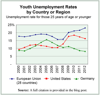
There are many things that play a role in the fluctuations of unemployment rates and these rates tend to be higher for younger people than for those more established in their work lives. Thus, having a youth population that is well trained for the jobs that are available seems a natural aid to keeping the youth unemployment rate down. From the data available on countries of the European Union—where the prevalence of apprenticeship programs is greater than in the United States, although it does vary from country to country—there seems to be a discernible connection between lower youth unemployment rates and the prevalence of robust apprenticeship programs. By way of comparison, we offer the graph that shows the youth unemployment rate for the first decade of the current century for the European Union, for Germany, and for the United States.

While the youth unemployment rate in the European Union as a whole, in 2012, was 23% it ranged widely from a low of 8.1% in Germany to a high of 55.3% in Greece. Interestingly, the two European countries with the lowest youth unemployment rate are also two of the countries in the Union with the most robust apprenticeship programs, Germany and Austria.

In the United States, apprenticeship programs are not as heavily used as they are in Europe. Trade unions used to be primarily a source of such programs in the United States but with the decline in union membership over the last decades these programs have also been in decline. That is until recently. European companies are starting to establish apprenticeship programs in the United States to train the workforce they need for their U.S. facilities.

Today’s market size is the number of people in the United States participating in apprenticeship programs that are registered with the U.S. Department of Labor. The approximate number participating in such programs in Germany is also provided.

Geographic reference: United States and Germany
Year: 2012
Market size: United States: 358,000 (with an additional, approximately 450,000 involved in programs not registered with the Department of Labor)
Market size: Germany: 1.6 million
Sources: (1) “Registered Apprenticeship National Results,” U.S. Department of Labor, Employment and Training Administration, June 7, 2013, available online here. (2) Unemployment Rate by Age Group,” Eurostat, October 31, 2013, available online here. (3) “Apprenticeships: Earn while you learn,” Bureau of Labor Statistics, Summer 2013, available online here.
Original source: U.S. Department of Labor and Eurostat
Posted on December 2, 2013

Roundabouts

Roundabout

Roundabouts are a road design used to replace a traditional four or six-way intersection, referred to as a crossroads intersection, with a circular path around which traffic flows, continuously, in one direction. The graphic provides an overview of such a roundabout.

For a driver not accustomed to this sort of intersection, a roundabout may be disconcerting at first. However, study after study shows that in the right locations roundabouts are an improvement over more traditional crossroad intersections in two ways: by increasing the flow of traffic and by reducing (by 76%) the number of injury-producing accidents. The reduction in accidents leading to fatalities in a roundabout versus a crossroad intersection is even greater since speeds are reduced throughout the intersection. According to the U.S. Department of Transportation, there are 90% fewer fatal accidents in crossroads intersections that have been replaced by roundabouts.

Today’s market size is the estimated number of roundabout intersections worldwide, in 1997 and in 2012.

Geographic reference: World
Year: 1997 and 2012
Market size: 35,000 and 60,000 respectively
Source: “The Widening Gyre,” The Economist, October 5, 2013, page 16. The graphic comes from a Michigan Department of Transportation website, here.
Original source: U.S. Department of Transportation
Posted on November 25, 2013

Telephone Service: Landline versus Wireless

PhoneServiceMI

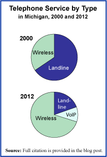
The past decade has been one of great changes in the telephone service landscape. As investment has been made in the wireless infrastructure, cell phone coverage has become much more reliable. With growing reliability of cell phones has come the option for many to do away with one’s landline phone service. The pie chart on the right shows this clearly. In the State of Michigan, the decline of landline accounts and the rise of wireless accounts has been significant since the turn of the century. For the year 2012, the graph includes a count of the users of a system called VoIP, which stands for Voice over Internet Protocol and is a telephone-like service offered to those with access to high-speed Internet connections.

There is now legislation pending in the State of Michigan to allow landline telephone service providers to begin discontinuing service to customers, after a 90-day notice, starting in 2017. This legislation would, in essence, do away with the legal right to have access to landline phone service at almost any address in the United States, a right that dates back to the early 1910s and was updated most recently in the FCC Telecommunications Act of 1996.

Michigan would not be the first state to pass such legislation. Similar laws have already passed in other states like Texas, Florida, and North Carolina. As the landscape for telephone service changes, one can not help but worry about those in areas not well covered by alternate phone service options. While wireless coverage has improved significantly over the years it is not yet near universally accessible and many people still depend upon landline service for dependable telephone connectivity.

Today’s market size is the number of phone service accounts, regardless of type—landline, wireless cell service, and/or VoIP—in the State of Michigan in 2000 and 2012. Worth noting is the population of the State in Michigan in those two years; 9.94 million and 9.88 million respectively (yes, Michigan did actually lose population over this period). Thus, the number of telephone service accounts per capita has risen over this period from 1.03 to 1.35.

Geographic reference: Michigan
Year: 2000 and 2012
Market size: 10.2 million (66% of which were landline accounts) and 13.3 million (20% landline accounts) respectively
Sources: (1) Kathleen Gray, “Still Have a Landline? Proposed Michigan Legislation Could Spell The End by 2017,” Detroit Free Press, November 18, 2013, available online here. (2) David Cay Johnson, “Phone Service for All, No Matter What Kind,” Reuters, March 28, 2012, available online here. (3) “State & County QuickFacts—Michigan,” an extract of Census Bureau data on population statistics made available on the Census web site here.
Original source: U.S. Federal Communications Commission and the U.S. Census Bureau
Posted on November 18, 2013

U.S. Veteran Population

Veterans2

Today we present a brief market size post on the U.S. veteran population, in honor of those veterans on this Veteran’s Day. The pie chart shows the population broken down into four age groups. While the total number of veterans has been declining for many decades now, the number of veterans living with service-connected disabilities has been rising. Between 1990 and 2012, the number of veterans with service-connected disabilities grew by 46%.

Geographic reference: United States
Year: 2013 and a projection for 2020
Market size: 21,972,964 and 19,604,276 respectively
Sources: (1) “Table 1L: VETPOP2011 Living Veterans by Age Group, 2010-2040,” a statistical table made available by the U.S. Department of Veterans Affairs on their website here, towards the bottom of the page on the right side. (2) “Trends in the Utilization of VA Programs and Services,” prepared by the National Center for Veterans Analysis and Statistics, January 2012, available online here.
Original source: U.S. Department of Veterans Affairs
Posted on November 11, 2013

Libraries

Anyone who is truly interested in knowledge will be a friend of the library. Even in an age which defines itself as the “information age,” libraries play an essential role in society. In fact, based on U.S. library usage data from this century, that role is growing.

Today’s market size is the estimated total number of libraries in the United States. The largest category of library is the school library, which accounts for slightly over 80% of all libraries and does not include the academic library which is associated with higher education. The second largest category of library is the public library with a 7.5% share of the total.

Geographic reference: United States
Year: 2010
Market size: 119,987
Source: “Number of Libraries in the United States — ALA Library Fact Sheet 1,” American Library Association, August 2013, available online here.
Original source: The ALA web site provides a long list of sources upon which the organization drew in order to reach the total count.
Posted on September 23, 2013

Newspapers

Newspapers

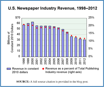
The news this week about The Washington Post being purchased for $250 million by Amazon founder Jeff Bezos made us want to update an earlier post about the newspaper industry, here. And so, we present today’s market size post, including a chart that shows U.S. newspaper industry revenues, annually, since 1998. Clearly, an industry going through significant change.

Geographic reference: United States
Year: 2000 and 2012
Market size: $50.29 billion and $32.04 billion respectively
Source: “Table 3.0.1 Information Sector Services (NAICS 51) — Estimated Revenue for Employer Firms: 1998 Through 2004,” Service Annual Survey, April 2006, page 24, available online here, and annual updates of the same which are available on the Census Bureau’s site here.
Original source: U.S. Census Bureau
Posted on August 9, 2013

Hospitals in the United States

Hospitals2

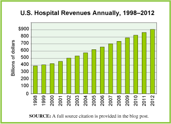
Today we update an earlier post on a part of the huge health services industry, namely, hospitals. The graph shows the total annual revenues of all U.S. hospitals as they are defined by the Census Bureau, below, over a fifteen year period. Annual revenues for this industry appear to rise, regardless of economic conditions, recessions, financial crisis, or business cycles.

This industry is identified within the industry coding system, NAICS, with the code 622 and is defined by the Census Bureau as including hospitals whose primary business is to “provide medical, diagnostic, and treatment services that include physician, nursing, and other health services to inpatients and the specialized accommodation services required by inpatients. Hospitals may also provide outpatient services as a secondary activity. Establishments in the Hospitals subsector provide inpatient health services, many of which can only be provided using the specialized facilities and equipment that form a significant and integral part of the production process.”

Geographic reference: United States
Year: 2005 and 2012
Market size: $620.85 billion and $904.47 billion respectively
Source: “Table 1 – Selected Services, Estimated Quarterly Revenue for Employer Firms,” Annual Benchmark Report for Services through 2012, a series of reports put out by the Census Bureau in conjunction with their Service Annual Survey, published every non-Economic Census year. The Service Annual Survey reports are accessible on the Census web site here.
Original source: U.S. Department of Commerce, Economics and Statistics Administration, U.S. Census Bureau
Posted on July 10, 2013

Public Transportation—Lansing, Michigan Area

The Capital Area Transit Authority (CATA), in Lansing, Michigan, is the largest public transit provider in the tri-county area near the State Capitol, which includes Ingham, Clinton, and Eaton counties. CATA has been operating public transportation in the mid-Michigan area since 1972 and has been twice named the best transit system of its size in North America by the American Public Transportation Association.

Ridership grew steadily during the 1970s, before leveling off during the 1980s and most of the 1990s. During the 1980s and 1990s, the number of rides fluctuated around 3 to 4 million annually. In 1999, CATA took over the Michigan State University bus service. Since then ridership has increased nearly 3-fold. In contrast, the population of the tri-county area grew by 22.6% from 1970 to 2010. In 2012, CATA set a third consecutive yearly record for number of rides. Data represent the number of rides annually on CATA vehicles in 1972 and 2012.

Geographic reference: Lansing, Michigan
Year: 1972 and 2012
Market size: Fewer than 1 million rides and 11.86 million rides respectively
Sources: “Growth in Ridership Remains Strong”, CATA 2013 Community Report: Moving You Toward Your Dreams, June 2013, p. 4; “Riding High with Record Ridership,” CATA 2012 Community Report 40th Anniversary Edition: Greater Lansing on the Move, August 2012; “CATA Demand Grows with Community Need,” CATA 2011 Community Report: Greater Lansing on the Move, August 2011; Tri-County Regional Planning Commission, “Tri-County Regional Growth: Choices for Our Future,” Draft Report, August 2002 available online here; “Ingham County, Michigan” available online here; “Clinton County, Michigan” available online here; and “Eaton County, Michigan” available online here;
Posted on June 26, 2013

Military Active Duty

Today’s market size is the number of active duty military personnel in the United States and in China. When looking at comparative national data, always be sure to take into account how the measure… measures up, if you will, on a per capita basis.

Geographic reference: China and United States
Year: 2011
Market size: China: 2,285,000 (equal to 1.69 persons per 1,000 in the population)
Market size: United States: 1,430,000 (equal to 4.52 persons per 1,000 in the population)
Source: “The Growth of The Chinese Military,” Military Education, A Non-Government Military Education Resource, available online here. Various figures were also taken from the CIA World Factbook, available here.
Original Source: Central Intelligence Agency
Posted on June 14, 2013

Trucking Industry

Freight Transport by Mode Pie Chart

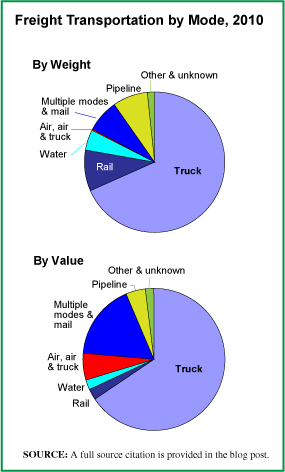
In the United States, trucks move more freight than do all the other forms of transportation combined and this is true when measured in terms of tons moved (68.2% in 2010) as well as in terms of the value of that freight (65.5%). The pie chart shows the percentage of total freight moved by each type of transportation vehicle, both in terms of weight and value. What is clear and quite logical is that the value of items moved by air is quite high but those items don’t weigh much. To move heavier freight, such as construction materials, heavy machinery, agricultural commodities, coal and the like, the nation’s highways, waterways and railways are the economical answer, and for the heaviest items, the latter two networks are the more economical.

Today’s market size is the weight of domestic freight moved by trucks in the United States last year and the revenue those movements produced for the trucking industry.

Geographic reference: United States
Year: 2012
Market size: 9.4 billion tons moved, generating $643 billion in revenue for the trucking industry
Source: Benjamin Preston, “Wheelies: The Stingray’s Stinger Edition,” Wheels.blogs.nytimes, May 30, 2013, available here. The data used to produce the graphic are from Freight Facts and Figures 2011, “Tables 2-1, 2-1M and 2-2.
Original Source: American Trucking Association and the U.S. Department of Transportation, Federal Highway Administration.
Posted on June 5, 2013

Psychiatric Hospitals

A great deal of attention is paid to the health care industry and its remarkable rates of growth. However, one segment of that industry has not experienced growth, has in fact shrunk. That segment is psychiatric hospitals. Because of changing policies and attitudes about how the mentally ill should be treated, psychiatric hospitals have been on a steady decline for many decades in the United States. The number of beds available in psychiatric hospitals in 1955 was equal to 1 bed for every 300 people in the general population. In 2005, that number had fallen to 1 bed for every 3,000 people.

Yet the rate of serious mental illness in the society has not changed during the fifty years between these two measures. This means that many, many mentally ill people end up incarcerated and/or, when they reach a breaking point, in the emergency rooms of general hospitals. According to a 2007 report from the National Health Policy Forum, there were nearly 2 million admissions to general hospitals in 2004 of patients suffering from mental health problems. Clearly, demand for some important things is not met through the mechanisms of a free market.

Today’s market size is the number of beds available in psychiatric hospitals in the United States in 2005.

Geographic reference: United States
Year: 2005
Market size: 99,800
Source: “More Mentally Ill Persons Are in Jail and Prison Than Hospitals: A Survey of the States,” a report published by the National Sheriffs Association and the Treatment Advocacy Center, May 2010, available online here. Eileen Salinshy and Christopher Loftis, PhD, “Shrinking Inpatient Psychiatric Capacity: Cause for Celebration or Concern?” National Health Policy Forum, August 1, 2007.
Posted on April 30, 2013

U.S. Prison Population

U.S. Prison Population, 1980-2011

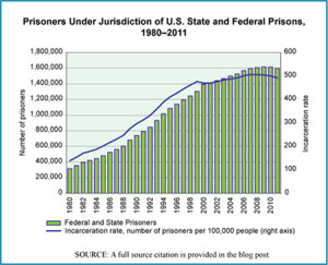
The number of people in prison in the United States is the highest in the world when calculated in terms of number per capita. The U.S. incarceration rate as of December 31, 2011 was 492 people per 100,000 in the population, and this did not count those in jail, awaiting trial or serving very short sentences. Those in jail increase the total number incarcerated by three-quarters of a million people. The chart shows the number of prisoners in the United States, annually, between 1980 and 2011 and includes only those in federal or state prisons but not those in jail.

Today’s market size is the number of people in the United States under the jurisdiction of state or federal corrections authorities as of December 31, 2011. These are people convicted of a crime and serving a prison term.

Worth noting is the fact that 8% of those in prison (at the end of 2010) were housed in private prisons run for profit. Leaders in the private prison business are CCA (Corrections Corporation of America) and GEO Group, Inc. which together account for approximately half of the prison contracts in the United States. As of January 1, 2011, 31 states contracted with private companies to house a portion of their prisoners. Texas had the largest number of persons in privately run prisons, 19,155 or 11% of its prison population. New Mexico had the largest percentage of its prison population housed by private prisons, 43.6% or 1,503 prisoners.

Geographic reference: United States
Year: 2011
Market size: 1,598,780 people
Source: E. Ann Carson and William J. Sabol, “Prisoners in 2011,” December 2012, a Bulletin published by the U.S. Department of Justice, Bureau of Justice Statistics, and available online here. The figures related to private prisons come from Cody Mason, “Too Good to be True, Private Prisons in America,” The Sentencing Project, January 2012. The data for the graphic came from the above cited Department of Justice report as well as the Statistical Abstract of the United States, 2004–2005, page 208, “Table 338–Federal and State Prisoners, by Sex, 1980 to 2002,” Bureau of the Census.
Original source: U.S. Bureau of Justice Statistics and U.S. Census Bureau
Posted on April 4, 2013

Aircraft

Commercial Airline Fleet numbers

Upon the news of the merger of American Airlines and U.S. Airways, creating in the process the largest passenger air carrier in the world, our attention is again drawn to the commercial airline industry. It has been a very rocky century so far for this industry.

In late 2011, the parent company of American Airlines, AMR, filed for bankruptcy protection, making American Airlines the last of the big six U.S. airlines to file for bankruptcy protection since the turn of the century (they are listed below). The use of commercial, passenger aircraft as missiles in the September 11, 2001 attacks in the United States can be seen as the first of many disruptions to the system, disruptions that included a worldwide financial crisis and a region-wide shutdown of air traffic due to the threat posed by volcanic ash. Underlying all of this has been the steady increase in the price of jet fuel which now makes up just over one-third of operating expenses for the industry as a whole.

Today’s market size is the number of aircraft being operated by U.S. air carriers. This number does include aircraft used for freight (12.3%) but does not include private jets or the fleets operated by small companies offering nonscheduled, special order flights. The graph shows how the industry fleet size has changed over the past 17 years. A line is also provided on the graph that shows the average, industry-wide, passenger load factor each year (PLF). The PLF is a calculation of Revenue Passenger Miles (RPM) divided by Available Seat Miles (ASM).

Geographic reference: United States
Year: 2001 and 2011
Market size: 8,497 and 7,185 aircraft respectively
Source: “TABLE 2-6. Number of U.S. Aircraft, Vehicles, and Other Conveyances: 2004-2009,” Transportation Statistics Annual Report-2010, Research and Innovative Technology Administration (RITA) – U.S. Department of Transportation (US DOT), available online here. Data for 2010 and 2011 are from an article by Aaron Karp, “FAA: US Commercial Aircraft Fleet Shrank in 2011,” March 13, 2012, Airports Today, available online here. The data on passenger load factors in the graph are from another report by the Bureau of Transportation Statistics, available online here.
Original source: U.S. Bureau of Transportation Statistics, Federal Aviation Agency

Largest Bankruptcy Filings in the U.S. Airline Industry since 2000

TWA (2001)
U.S. Airways (2002)
United Airlines (2002)
Delta Air Lines (2006)
Northwest Airlines (2006)
AMR (American Airlines) (2011)

Posted on February 14, 2013